Class hours: 9:40 – 2:05
Mr. Bohmann
wbohmann@ewsd.org
Today’s Notes
- Today is an EHS A Day
- Nov. 6th: Vermont Technical College Williston Campus Open House. Register here
- Nov. 7th: NEACAC Fall Virtual College Fair, 1:00-3:00pm. Register here
- Nov. 10th: VSAC Forms Day (Round 2) From 10-12:00 in the Conference Room Register here
- Nov. 13th: Vermont Technical College Randolph Campus Info Session. Register here
- Nov. 14th: Sterling College Virtual Open House, 11:00-3:00. Register here
- Nov. 17th: Vermont Technical College Visit to specific programs then 11:30 in the Conference Room for anyone else who has questions!
- CCV Class tomorrow – meet at the lobby at 9:15pm
- About Me is due on Friday!
- Print my Photo Dropbox is not located in Public Folders. Submission Format: Title_Lastname.jpg
9:40 Attendance
9:45 Graph of the Week
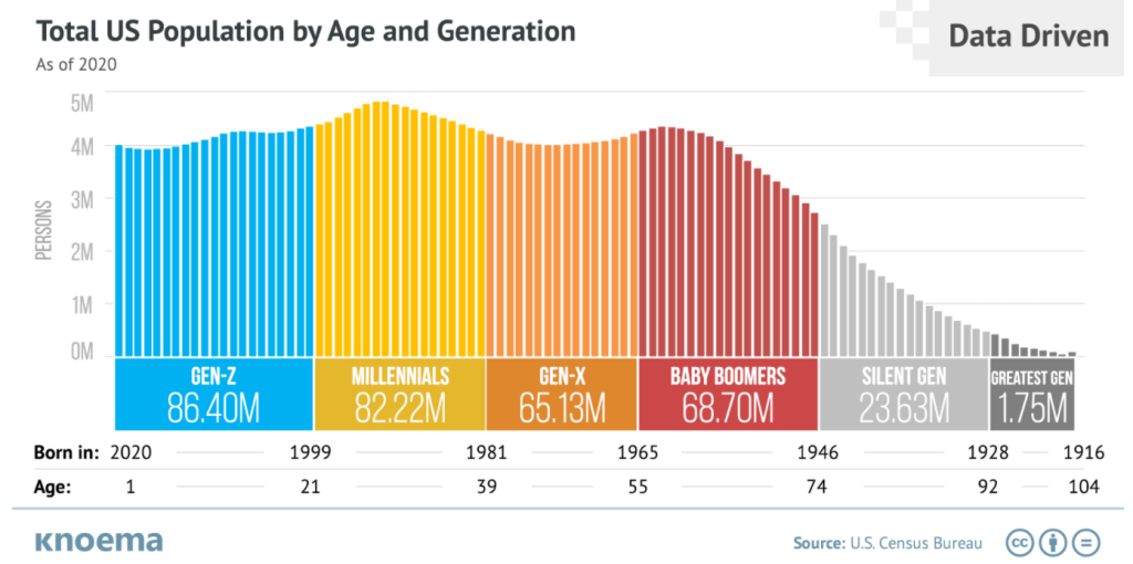
is communicating to you. – Assignment is in Google Classroom – Week 11
10:00 Block/Inline Elements and Box Sizing – Border Box Properties
Divs are nothing more than boxes. In fact, all of the elements you are using are basically boxes.
Some elements (boxes) take up the whole page left to right (we call those block elements!) Some examples of block level elements are: paragraphs, headings, lists, address, blockquotes, div, articles, sections, header, footer, form
Some elements are inline and take up a box or space (in the line) of the content they are found. Some examples of inline elements include b, em, var, button, label, span, abbr, small
Let’s tackle an issue out there that you might come across – border-box
By default, the width and height of an element is calculated like this:
width + padding + border = actual width of an element
height + padding + border = actual height of an element
If you think carefully, this can create a problem when trying to line up content on a webpage. If you set a width and height of an element to say 200px and add padding of 5px and a border of 1 px = well you may have a problem because the width and height of your box is no longer 200px!
Let’s build an example in CodePen together to see how this works. Then, let’s fix the problem.
To the rescue! – is the asterisk (*). The asterisk will apply a property and value to all elements. We will declare this in our Stylesheet. The *:before and *:after means this rule will apply to any pseudo elements too
*,*:before, *:after {box-sizing: border-box}
10:35 Mask Break
10:45 CSS Flexbox & Flexbox Containers, Revisited
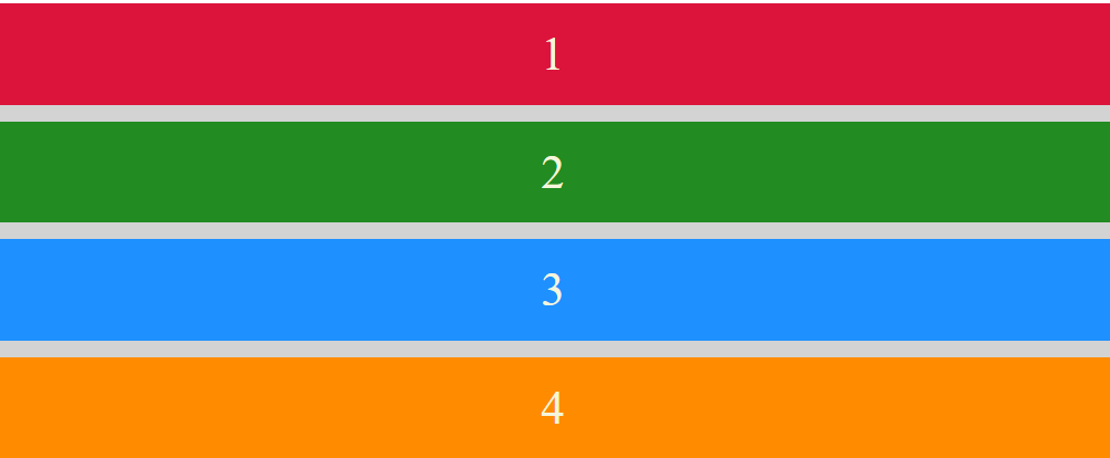
CSS flexbox (also referred to as flexible box) provides control over how elements are positioned, aligned, and sized within their container.
Remember, those elements have to be in a container (like a <div> or <section>).
Flexbox allows you to do things like, specify how elements are aligned vertically and horizontally, change their order of appearance, change the direction in which all elements are laid out, and more.
Before flexbox, elements had to be positioned and floated and complex layouts could be really challenging
A very good explanation of Flexbox #1 –
A very good animated explanation of Flexbox #2 –
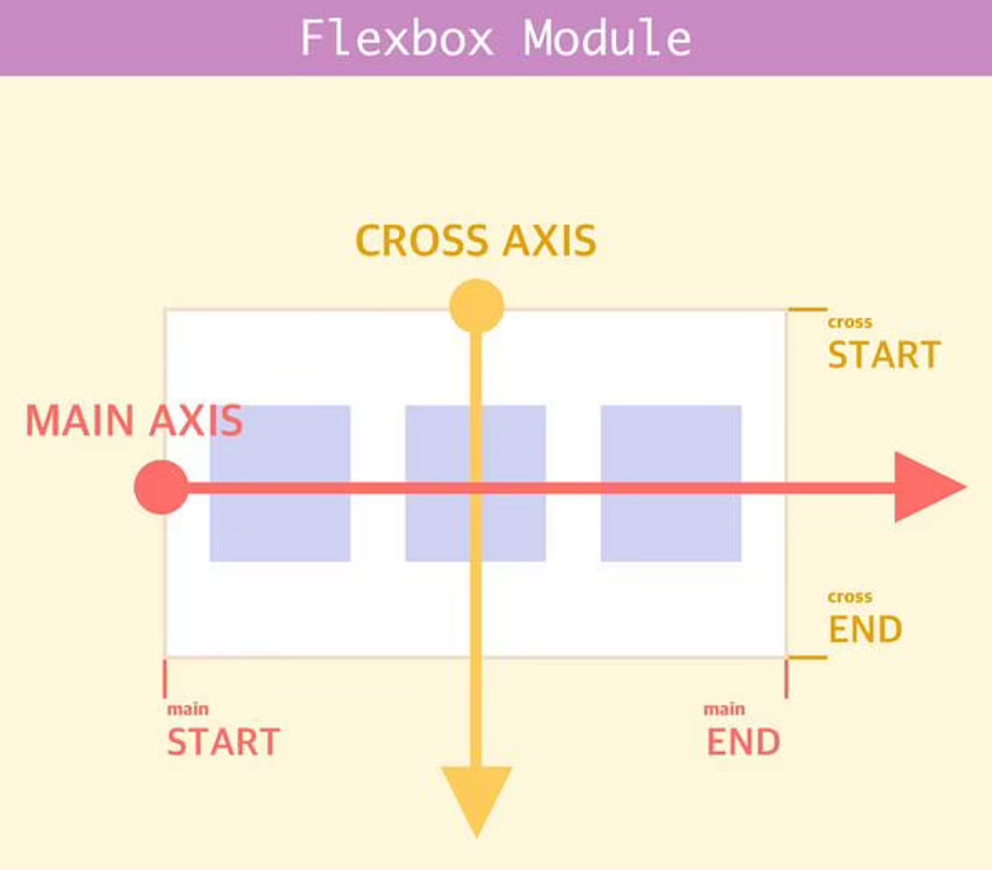
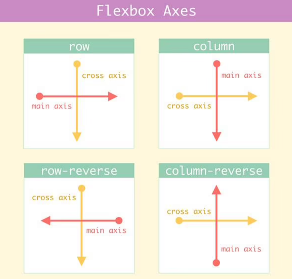
CSS flexbox properties define how flex items are sized, how they wrap and which direction they go in.
Flexbox items grow and shrink depending upon how much content is needed to fit the box.
Let’s build a sample in CodePen so you can see what I mean. It’s called flex for a reason!
Activity: Create a Photo Gallery using Flexbox. Based on what we just learned, this should be pretty easy. All we need are some photos and we need to decide what direction we want our flex direction to be: row or column.
You will need:
- A Project Folder- Name it PhotoGallery Practice
- An images folder with images 6-9 of them
- Images – you may want to adjust the size of them (pro-tip)
- A html document – name it photogallery.html
- Don’t forget to load up the <head> tag with all that awesome meta data
- A css style sheet linked to your html document
- We’ll do a gallery walk before lunch of your photo gallery.
- FTP sometime today to the server
12:15 Lunch

12:45 Text Shadows + 1more

Very simple – all we need is a h value, v value, blur radius and color!
1:10 Mask Break

1:20 Production Time and Guided Support
CAWD Sweatshirt Design
HTML Resume
About Me Paragraph
Photo Gallery
EB Elixir (our first website) – if you did not finish