Class hours: 9:40 – 2:05
Mr. Bohmann
wbohmann@ewsd.org
WEEK Fourteen
Today’s Notes
- Today is an EHS A Day
- Winter break begins in 3.5 weeks. It will go quick. Are you complete in your other classes?
- Vermont Competition – cash available – VT Entrepreneurs
- Carter – you have a VSAC appt on November 29th
9:40 Attendance
9:45 Monday Mail
9:45 HTML & CSS Review
10:00 Responsive Typography & Type Scales
Before the break we looked at the 3 ways to make a webpage responsive:
- Media Queries
- Images that Resize
- Fluid Layouts.
Well, Typography can also be responsive too. But first, let’s get an understanding of the basics.
Absolute Length Units
Absolute length units are considered absolute because they are not relative to any other element. These units will not scale to browser size and will always remain the same size. These include the following:
pt – points
px – pixels
in – inches
cm – centimeters
mm – millimeters
pc – picas
Pixels are really the only absolute CSS length unit we should consider using for the web. The others are mostly used for physical (not digital) measurement (like print). A pixel unit refers to the size of one “dot” of your device display (which will vary slightly with each device). Because of this, pixels are commonly used for things that don’t necessarily need to scale with browser sizes.
Relative Length Units
Relative Length units are considered relative because they change/scale depending on the length of other elements. One common example is percentage, which is dependent on the length of the parent element.
em – relative to the element’s font-size
rem – relative to the root element’s font-size
vw – relative to 1% of your browser’s viewport width
vh – relative to 1% of your browser’s viewport height
vmin – relative to 1% of the smaller of the two browser viewport dimensions (height or width). vmin uses the ratio of the smallest side. That is, if the height of the browser window is less than its width, 1vmin will be equivalent to 1vh . If the width of the browser is less than it’s height, 1vmin is equvialent to 1vw .
vmax – is the opposite. vmax uses the larger of the viewport width or height to set the size.
% – relative to 1/100 of the parent element’s width.
All of these units are used for the web. Want to see an example of all of these in action and understand the difference between em and rem- Fork my CodePen
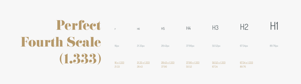
Modular Type Scales
You’ve heard of musical scales, well the same concept can be applied to typography. Modular Scale typography grows and shrinks based on a ratio. Using a ratio allows the type to look consistent and related.
Some sites do better with large type and contrasting sizes better than others sites…
For example, product sites, shopping sites and commerce sites tend to do better with smaller changes in type size.
Marketing sites (like Apple for example) tend to use large type sizes and show great range in the type size variation.
Let’s play around with type scale. A nice tool is type-scale.com
Using a Scale = Consistency in Design!
Let’s practice. Fork this CodePen.
10:35 Mask Break
10:45 English with Ms. Yopp
11:35 Mood Boards / Inspiration Boards / Portfolio Pre-Planning
Leading up to our next break, we are going to begin working on a multipage website that will serve as a portfolio about you. This portfolio will culminate into a final website due at the end of the semester. I’ll share deliverables in the weeks to come and will carve out work time to build a nice professional website.
We’ll include your bio, an image, some reflections as well as a host of really nice exemplars of your work covering many disciplines. This will be a nice professional portfolio of your work that you can show an employer or college or to turn in to your own website showcasing you and your content.
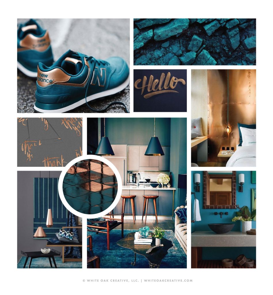
To prepare, you’ll want to do a little research. It’s common for most projects to include an inspiration board or mood board. When I worked for NIKE shoe company, all new models from shoes to clothing included a mood board for the design team to work from.
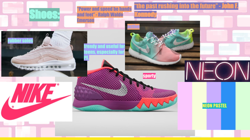
Start by google searching 2019 / 20 / 21 website trends, portfolios, web color palettes, student portfolios, web design awards… See anything you like?
The Deliverable
Create a Google Slide Show to showcase your inspiration.
Create a slide for:
- Fonts
- Color Palettes / Color Themes
- Icons you might like to use and your logo
- Design elements (layouts you like)
- Website features (sliders, gradients, lightboxes, interactions)
- Links to websites you like
- Anything else you see that you’d like to share
You will present your Mood Board Slideshow on Wednesday this week before lunch.
The dropbox is found on Google Classroom. Filename: Mood Board
12:15 Lunch
12:45 Skinny Lesson
Challenge: CodePen Dropbox
1:10 Mask Break
1:20 Production Time & Guided Support
- Mood Board Slide show (created with Google Slides) Due Wednesday
- CSS Two Ways (due today)