Class hours: 9:40 – 2:05
Mr. Bohmann
wbohmann@ewsd.org
Today’s Notes
- Today is an EHS B Day
- Let’s fill the box! Last Day to bring in non-perishable food items
- PreTech visitors coming tomorrow – we have eight students so far
9:40 Attendance
9:45 Light / Dark Mode – Bespoke User Styles

Last week we used a little JavaScript toggle a button that changed our default webpage into a dark mode. Well, let’s build on the same concept but go a little further…
What if the user could choose between multiple color modes? We can use JavaScript to access the <head> tag and set up several custom style sheets so the user can view your website through different style sheets.
We’ll build this one in ATOM so we can properly access the <head> element. We can use one of the projects from last week. We’ll also learn how to link to a js folder to call our script. Just like we do with our stylesheets.
//here is some code we'll need

function swapStylesheet (newstyle){

document.getElementById('pagestyle').setAttribute('href', newstyle);

}

//The setAttribute() method is used to set or add an attribute to a particular element and provides a value to //it. If the attribute already exists, it only set or changes the value of the attribute. So, we can also use //the setAttribute() method to update the existing attribute's value.
10:35 Mask Break
10:45 English with Ms. Yopp

11:35 Bootstrap
Bootstrap – one of the most popular HTML/CSS and JavaScript frameworks on the web.
If there is one take-away about Bootstrap is that the classes you use in conjunction with your html elements create a lot of the layout and style! Here is an excellent Cheat Sheet
The second takeaway and most important part of understanding Bootstrap is that Bootstrap is built on the Grid system and is a mobile first approach.
Bootstrap pages always have the following pattern:
- A <div class=”container”> to wrap everything
- A <div class=”row”> to start a new row
- A <div class=”col-md-8> or some other arrangement of columns within the row . col – * – * Let me explain:
col stands for column
sm stands for the size screen your column will break, sm is a good default
8 stands for the number of grid spaces you want the column to take (there are 12 grid spaces in Bootstrap)
<div class="container">
 <div class="row">
     <div class="col-sm-4">
      One of three columns
     </div>

     <div class="col-sm-4">
       Two of three columns
     </div>

     <div class="col-sm-4">
        Three of three columns
     </div>

 </div>
</div>
Activity: Let’s Tackle how this Grid System Works
We’ll build several rows and columns of content.
Rows prepare the grid
Columns take on the content inside the grid
Any content can go in the grid. Maybe we should make some cards! or use some flexbox.
12:15 Lunch
12:45 Bootstrap Menu Challenge
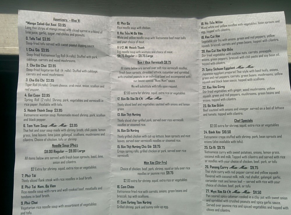
Menu Challenge – Pho Hong
Pho Hong is a Vietnamese Restaurant in Burlington. Link to Menu
Deliverable: Create a one page menu
- Pick just two sections (of the menu). Create a one page menu using Bootstrap. You will build this in ATOM.
- Use Font Awesome to help with icons or try out the new Bootstrap Icons!
- Use HTML Special Symbols to help with those special characters if necessary
- Style however you like using only Bootstrap (no CSS!)
- Name PhoMenu and link all necessary files. Load to the server.
1:10 Mask Break

1:20 Production Time & Guided Support
Bootstrap Menu (due Wednesday)
Overdue or past due homework