Class hours: 9:40 – 2:05
Mr. Bohmann
wbohmann@ewsd.org
WEEK THIRTEEN
Today’s Notes
- Today is an EHS B Day
- Vacation begins Friday afternoon – Nice
- CCV Classes end on December ?
- Nov. 17th: Vermont Technical College Visit to specific programs then 11:30 in the Conference Room for anyone else who has questions!
- Congratulations EHS Football and Volleyball – State Champions!
9:40 Attendance and Monday Mail
9:50 CSS & Responsive Design
The last two weeks we tackled CSS Flexbox and CSS Grid. Both modern approaches provide improved ways to create web pages and layout web content. Both options also allow for lots of flexibility for changing the design without heavy code changes.
This week, we’ll look at Responsive Design. Responsive design allows web developers to improve the web experience by designing for multiple screen sizes. And there are many.
Responsive Design consists of three characteristics:
- Media Queries
- Images that resize
- Fluid Layouts (using Grid, Flexbox or % for widths)
This week we’ll tackle responsive design. There are two schools of thought about responsive design:
1. Mobile First. 2. Desktop First
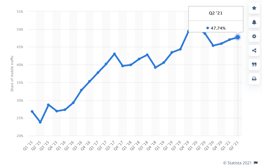
In 2015 Mobile web traffic made up about 27% of web traffic world wide. Twice as much as 2013 and half as much as we see today. So, given the graphic, what responsive design school of thought should we begin to adopt?
Responsive Design: Characteristic #1 Media Queries
The Viewport Meta Tag: gives the browser instructions on how to control the page dimension and scale. This code should go in every <head> element of your html web pages
<meta name="viewport" content="width=device-width, initial-scale=1.0">width=device-width set the width of the page to follow the screen width of the device
What makes a layout go from fluid to responsive is the use of Media Queries
@media screen and (max-width:  1000px) {
     p {
          font-size: 24px;
       }
}

/* The @media is the media rule */
/* Screen is the media type. */
/* (max-width: 1000px) is the media feature */
/* What this query means is when the browser viewport is smaller than 1000px, apply this block of CSS
If this condition is not met, then this CSS is ignored */

/*There are 4 Media types:  all, print, speech and screen */
School of Thought #1 Mobile First
A mobile first approach means writing your CSS to cater to smaller screen sizes. Media queries are then used to make changes for bigger screens. This approach usually uses min-width media queries.
School of Thought #2 Desktop First
When writing CSS, you write for the desktop and then add media queries for smaller screens. This is probably the more familiar practice to you and the one you likely did last year. This approach usually uses max-width media queries.
Activity:
Today we’ll do a coding walk-through of setting up a responsive page to refresh your memory. Let’s start with the Mobile First approach. Please download my sample files, unzip and open in Atom. If you want to change the default images I’ve put inside, take a moment to check out this fun resource on image placeholders.
Using min-width
// Small devices (portrait phones, 375px and up)
@media (min-width: 375px) { ... }

// Small devices (landscape phones, 576px and up)
@media (min-width: 576px) { ... }

// Medium devices (tablets, 768px and up)
@media (min-width: 768px) { ... }

// Large devices (desktops, 992px and up)
@media (min-width: 992px) { ... }

// Extra large devices (large desktops, 1200px and up)
@media (min-width: 1200px) { ... }
Using max-width
@media (max-width: 575.98px) { ... }

// Small devices (landscape phones, less than 768px)
@media (max-width: 767.98px) { ... }

// Medium devices (tablets, less than 992px)
@media (max-width: 991.98px) { ... }

// Large devices (desktops, less than 1200px)
@media (max-width: 1199.98px) { ... }
10:35 Mask Break
10:45 English with Ms. Yopp

11:35 Practicing Media Queries: The Good, The Bad, The Ugly

Begin a Mobile First approach to designing your webpage.
To get started:
- Create a folder and name it: Responsive
- Inside create a CSS and Images folder
- Use the inspector and set the size to Mobile. Let’s choose the iPhone 5 Preset. Begin your styling here.
What to Do (Deliverables): Build a webpage that changes as the screen size changes.
We’ll call this assignment The Good, The Bad and The Ugly
Your website will include:
- H1
- 1 Good Guy image with paragraph
- 1 Bad Guy image with paragraph
- 1 Ugly image with paragraph
Up to 374px = Ugly
375px to 767px = Bad
768px and larger = Good
Check your HTML and CSS for Validation. Copyrighted images are ok for this assignment.
FTP the entire folder to the server when you are complete. Due Date: Wednesday, November 17th.
12:15 Lunch
12:45 Color Tools and Selectioning
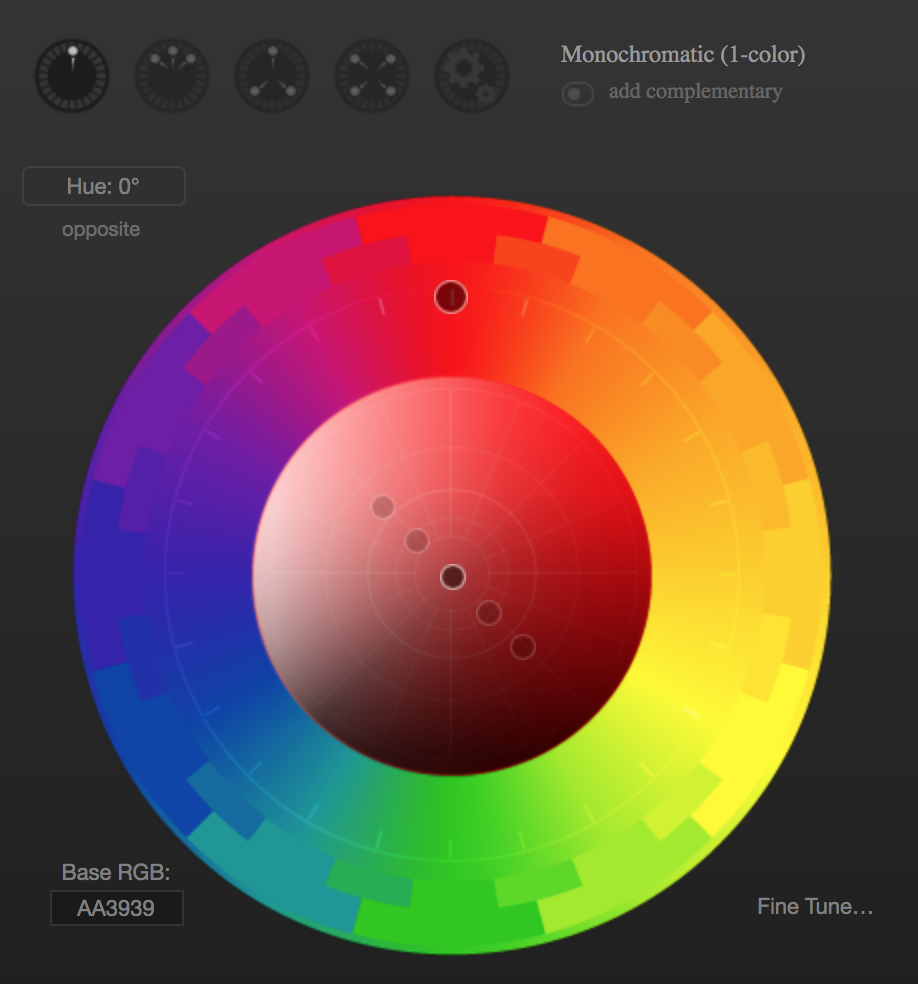
Let’s all navigate to Paletton.com and explore some tips and tricks to getting the right colors for your next project.
1:10 Mask Break
1:20 Production Time & Guided Support
Flexbox Photo Gallery (Past Due)
CSS Grid Post Its (Past Due)
Parallax (due today)
Flexbox Trading Cards (due today)
The Good, The Bad, The Ugly (Due Wednesday)