Class hours: 9:40 – 2:05
Mr. Bohmann
wbohmann@ewsd.org
Today’s Notes
- Today is an EHS A Day, also EHS Winter Sports sign-up is on
EHS Fall Musical tonight, tomorrow and Saturday 7-9pm - Carter – November 29th, VSAC Meeting
- CCV Class tomorrow – meet in lobby at 9:15am, don’t forget or we’ll leave without you
- A nice Codepen playground to click around to understand Flexbox better
9:40 Attendance
9:45 Graphic of the Week
Link to the Graphic of the Week handout
10:00 CSS Grid Review
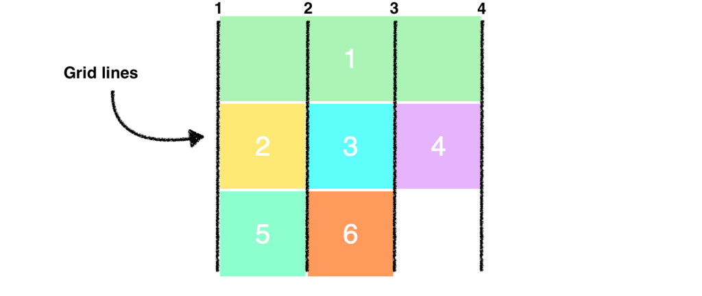
It’s been a week since we looked at and tried out CSS Grid. CSS Grid maybe a good solution to your layout ideas with the CSS Two Way project.
Let’s look at one of our previous codepens and come up with an improved layout using grid. In the process we’ll revisit the following key terminology:
- display: grid (you’ll need a container)
- grid-template-columns: (for setting number of columns)
- grid-template-rows (for setting rows)
- grid-gap (for setting the gap between the grid areas)
- fr (stands for fraction, can be used instead of percentage)
- minmax (for setting height min and max or width min and max)r (stands for fraction, can be used instead of percentage)
We’ll use the codepen we did about the Salamanders and the <aside> element – Remember to fork it first!
Challenge:
- Move the Aside to the other side.
- Add a Navbar with 4 links under the header that stretches the container
- Style the anchor tags
10:35 Mask Break

10:45 Flexible Sizing with Flex Basis Properties
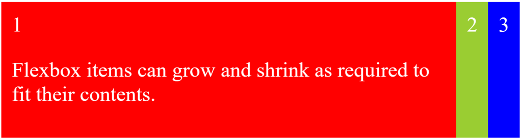
Introduction – When a flex container is defined, flex items resize themselves automatically. But sometimes you may need to set a specific size to the flex items. When that is the case, we can use the flex property!
Fork my Codepen and we’ll play in the sandbox
Terminology to know:
- flex-grow
- flex-shrink
- flex-basis
- flex (which is shorthand for the 3 properties above)
Definitions:
Flex refers to the properties that apply to the elements in the container
Flex Basis: controls the size of an element before it is manipulated by other flexbox properties
Flex-grow: controls how an element will grow (or not) if there is additional space in a container.
The default is zero, items are not set to grow by default.
Setting the grow property to 1 or higher will override. Flex-grow: 1.
Flex-shrink: controls how an element will shrink if there is not additional space in a container.
The default is 1 – which means yes, shrink the content if there is not additional space.
Flex: is the shorthand recommended by the W3C to reduce redundancies.
default is: flex: 0, 1, auto
In this order: grow, shrink, auto
11:15 CSS Two Ways Project Work Time
Use this time to work on your project. Remember to review yesterday’s dayplan for deliverables.
Run all work through the HTML and CSS validator.
Hey! Maybe have another student look at your work and provide design feedback….
12:15 Lunch

12:45 Design Challenge
Remember the Cinnamon Rye Raisin Bagel Handout – you did a Codepen of it. Here is mine
Challenge Details will be posted after lunch….
1:10 Mask Break
1:20 Production Time and Guided Support
Finish Challenge (if you did not)
CSS Two Ways
Tackle the Grid Garden
Past Due Work
CCV Work (especially if you are behind – you know who you are)