Class hours: 9:40 – 2:05
Mr. Bohmann
wbohmann@ewsd.org
Today’s Notes
- Today is an EHS A Day
- Color Tools we looked at yesterday:
- Paletton.com
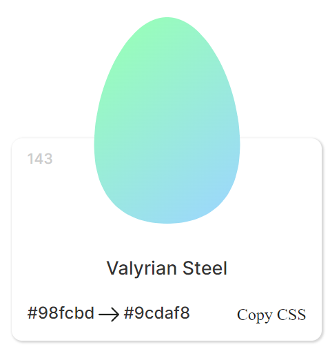
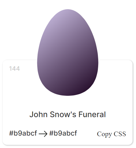
- Eggradients
- Adobe Color
- Huesnap
- coolors.co
- colordot
- Last CCV day is December 17th!
- Carter – VSAC Appointment – November 29th @10am
- Today’s CodePen Dropbox
9:40 Attendance
9:45 Responsive Design Continued….
Responsive Design consists of three characteristics:
1. Media Queries
2. Images that Resize
3. Fluid Layouts (using Grid, Flexbox or % for widths)
Yesterday we tackled a design using media queries with a Mobile First mentality.
Mobile First is designed mainly for functionality. It’s a very focused approach focusing on core functionality. As the design changes for higher resolutions (often called progressive enhancement) the additional features are added. The challenge is organizing the core content for all screen sizes and figuring out what is most important.
Responsive Design: Characteristic #2 – Images that Resize
In order to have responsive images, we need to get our images to scale to the device width.
So, to do this, we’ll tackle the width property.
Images in our HTML Document
If the width property is set to a percentage and the height is set to auto, the images will be responsive and scale up and down. For example:
img {
  width: 100%;
  height: auto;
}

//using this property will allow the image to scale down but never up higher than 100%
Take a look at our code from Monday. For fun – remove the img {max-width: 100%;} and see what happens at different screen sizes.
Images in our CSS document (background images)
If you call images in your CSS, the background-size property needs to be added. The image is added to the containing element. There are three methods for setting a responsive image in your CSS:
div {
 width: 100%;
 height: 400px; /*this depends on how large you want the container */
 background-image: url("../images/img_flowers.jpg");
 background-size: cover; /* or contain or set width & height */
}
- Contain (image keeps its aspect ratio) but may not fit as the image scales
- Width and Height set to 100% (image stretches to cover the content)
- Cover (keeps aspect ratio and covers but may clip some of the image)
Let’s make a Codepen titled Images in your CSS to see how this works.
HTML 5.1 the Picture Element
The <picture> element is a lot like the <audio> and <video> elements – very semantic. This is an easy element to use but not used as much as it should be.
Using the <picture> element, we can call up several different images and have them resize
and change within that element.
<picture>
 <source media="(min-width: 650px)" srcset="images/food.jpg">
 <source media="(min-width: 465px)" srcset="images/car.jpg">
 <img src="images/girl.jpg" style="width:auto;">
</picture>
According to this code:
- An image of a girl will show up as default and for screens smaller than 465px
- When the screen is larger than 650px and image of food will be displayed
- When the screen is between 465 – 649px an image of car will be displayed
Let’s do a quick sample together in CodePen.
Lastly, why do we care?… about the <picture> element
10:35 Mask Break
10:45 English with Ms. Yopp
11:35 CSS Menus / Navigation

Navigation is essentially nothing more than a list of links. Links can go to other pages or as we saw with using IDs, we can navigate to other sections on the same page by linking to those IDs (remember the smooth scroll CodePen)
<nav>
 <a href="#home">Home</a>
 <a href="#news">News</a>
 <a href="#contact">Contact</a>
 <a href="#about">About</a>
</nav>
The example above will produce a horizontal row of links. Using the semantic HTML5 element <nav> means we don’t have to use an unordered list. Less to code!
Let’s go to CodePen and have a go at some custom Navigation. You can use the code above as a starting point.
nav a {
 display:block; /* comment on and off this line */
 background-color: gold;
 text-decoration:none;
 text-align:center;
 margin:10px 0px;
 padding: 10px 0px;
}
Flexbox to the rescue!
With the addition of Flexbox to CSS, navigation has gotten even easier. For a flexible / responsive nav bar, just make sure you have a containing element. In this case the <nav> element is our containing element.
nav {
display:flex;
flex-direction:row;
flex-wrap: wrap;
}
Let’s use some flexbox built in properties to try some other layouts. Let’s add:
justify-content: center; /*also try flex-start, flex-end, space-around and space-between */ /* Then let's add some style to the anchor tags */

nav a {
padding:15px;
text-decoration:none;
background-color:gold;
text-align:center;
}
nav a:hover{
background-color: #efefef;
color: dodgerblue;
}
/* for fun, add transform: rotate(15deg); to the hover state */
Let’s go a bit further and add in the CAWD logo and a <header> because most often the navigation is found in this element. We’ll also add a button too.
Activity #1:
Create a new CodePen. Name it My Custom Navigation. Create your structure first, use Flexbox. Inside your <nav> element, include at least six links. Style as you like. Play around with the different properties. When complete, share your CodePen on the form in the top of the dayplan
Activity #2:
In Codepen, Recreate the top nav menu on this website https://trentwalton.com. Name it CopyThatNav. When complete, drop your link on the same form as you did earlier (top of the dayplan). Let’s see how close you get.
12:15 Lunch
12:45 Skinny Lesson – more gradients and blend modes
In CSS, there are two properties responsible for blending. mix-blend-mode is used to blend DOM elements, and background-blend-mode is used to combine multiple CSS Backgrounds.
CSS Patterns Gallery https://projects.verou.me/css3patterns – great resource to create your own
1:10 Mask Break
1:20 Production Time & Guided Support
The Good, Bad and the Ugly (due Wednesday)
Two Nav Bars – the activity we did after English (due today)