Class hours: 9:40 – 2:05
Mr. Bohmann
wbohmann@ewsd.org
Week Fourteen
Today’s Notes
- Welcome to Monday, Week 14 – Today is an EHS A Day
- We have visitors this week:
- Tuesday – Champlain College for recruiting presentation to CAWD tomorrow morning
- Wednesday – PreTech Visitors
- Thursday – MMU – Advanced Manufacturing program – mostly with CAWD 1
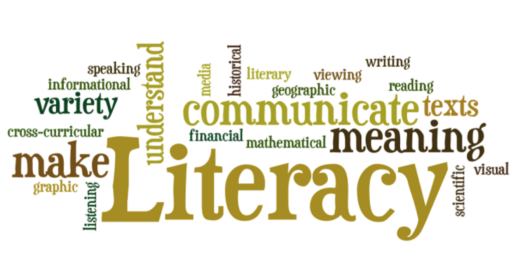
- Reading Grades – very easy to earn the A – are posted this week – Called Literacy in Practice
- Great Photographer Assignment – Let’s take a quick look at the requirements this morning
- Presentation with Title Page to include: Artist Name, Picture of Photographer and Your Name
- Photographer name, date and place of birth and/or death
- Relevant photography/art education (where did they study or learn from)
- Why this artist got into photography / What was their inspiration
- What the photographer is known for- commercial, fine art, documentary, war photography
- Explain what that means – what is fine art photography? for example
- Examples of their photography (at least 5 with title and date)
- Interesting details about your photographer (schooling, style, medium, film, why are they famous?)
- Bibliography slide
- Last Slide – Your photograph in the style of your photographer
- See the Assignment Document for more details. Practice, Practice, Practice
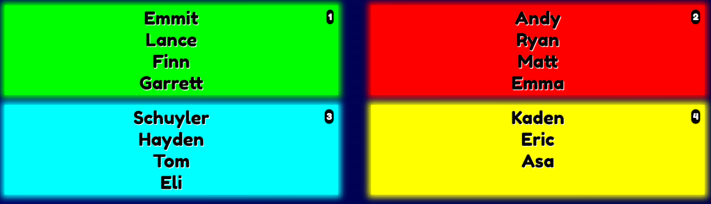
- Project Managers – CSS Comics are being presented today. Review Deliverables!
- We’ll start 20% at 9:55 this morning
9:40 Attendance
9:45 Monday Mail – make a quick check – you seniors are important!
9:55 20% Showcase – Random Order
The dropbox for projects is in Google Classroom. Presenting work to each other is not only educational but also a great way to practice and improve your speaking skills.
Filename example: 20%_lastName.(whatever file extension fits)
20% Projects will be declared by the end of the day on Mondays. A project may last more than one week. You might be building towards something. Be specific.
For example: Animation in Blender using a rig, Disappearing effect in After Effects, 2D sidescroller in Unity
When presenting: Three Questions to respond to:
- What did you learn this week?
- What are you working on/showing us?
- What are your next steps? Where do you go from here? / What are you working towards?
10:35 Break

10:45 English with Mx. Yopp
11:30 CSS Grid Comic Showcase
Let’s see your comic. Presented by Project Managers for each house.
Speak about: Process, division of labor, challenges
Responsive Design consists of three characteristics:
1. Media Queries
2. Images that Resize
3. Fluid Layouts (using Grid, Flexbox or % for widths)
Last Thursday we tackled a design using media queries with a Mobile First mentality.
Mobile First is designed mainly for functionality. It’s a very focused approach focusing on core functionality. As the design changes for higher resolutions (often called progressive enhancement) the additional features are added. The challenge is organizing the core content for all screen sizes and figuring out what is most important.
Responsive Design: Characteristic #2 – Images that Resize
In order to have responsive images, we need to get our images to scale to the device width.
So, to do this, we’ll tackle the width property.
Images in our HTML Document
If the width property is set to a percentage and the height is set to auto, the images will be responsive and scale up and down. It is that simple! For example:
img {
  width: 100%;
  height: auto;
}

//using this property will allow the image to scale down but never up higher than 100%
Let’s build a quick demo in the Codepen Sandbox. Name it image practice.
Images in our CSS document (background images)
If you call images in your CSS, the background-size property needs to be added. The image is added to the containing element. There are three methods for setting a responsive image in your CSS:
div {
 width: 100%;
 height: 400px; /*this depends on how large you want the container */
 background-image: url("../images/img_flowers.jpg");
 background-size: cover; /* or contain or set width & height */
}
- Contain (image keeps its aspect ratio) but may not fit as the image scales
- Width and Height set to 100% (image stretches to cover the content)
- Cover (keeps aspect ratio and covers but may clip some of the image)
12:15 Lunch
12:45 Literacy in Practice
1:10 Break
1:20 20% Production Time & Guided Support
- The Good, Bad and Ugly Website – Mobile First Approach – December 8th
- Famous Photographer’s Research Project – December 8th
- 20% For Week 14 – is now assigned