Class hours: 9:40 – 2:05
Mr. Bohmann
wbohmann@ewsd.org
Week Thirteen
Today’s Notes
- Today is an EHS A Day
- December 1st – Three week to Game Day! and the start of vacation
- Today is National Eat a Red Apple Day and on this day the Kingdom of Iceland was established
- Correction: Champlain College is coming to Cawd on December 6th at 9:45am. They’ll be hosting interviews from 12-2pm. Talk to Ms Charron if you want/need to set something up
- Also, Progress Period 2 ends tomorrow. That means we are halfway through Q2.
- Filenames: demo
9:40 Attendance
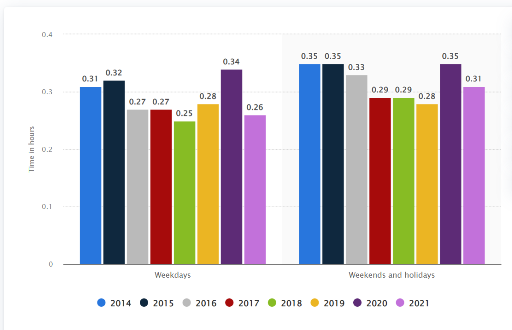
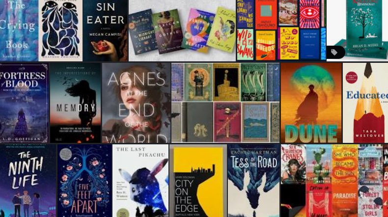
9:45 Graph of the Week
Average daily time spent reading per capita in the United States from 2014 to 2021
10:00 Responsive Design
This week and the week before break we tackled CSS Flexbox and CSS Grid. Both modern approaches provide improved ways to create web pages and layout web content.
Both options also allow for lots of flexibility for changing the design without heavy code changes.
Today, we’ll begin to look at Responsive Design. Responsive design allows web developers to improve the web experience by designing for multiple screen sizes. And there are many.
Responsive Design consists of three characteristics:
- Media Queries
- Images that resize
- Fluid Layouts (using Grid, Flexbox or % for widths)
There are two schools of thought about responsive design:
- Mobile First
- Desktop First
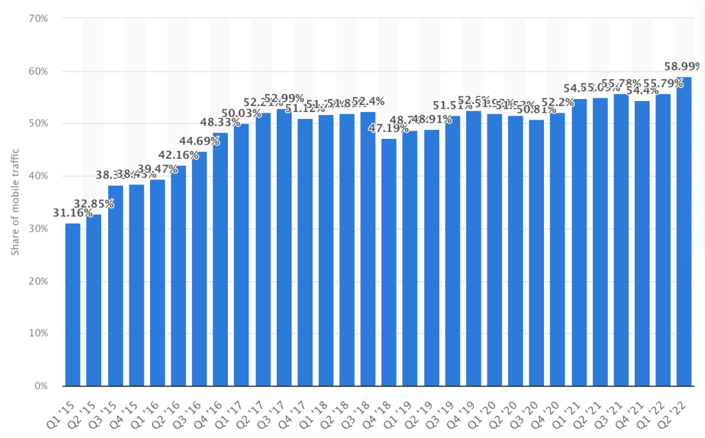
In 2015 Mobile web traffic made up about 31% of web traffic world wide. Today mobile traffic is nearly 60%. So, given the graphic, what responsive design school of thought should we begin to adopt?
Responsive Design: Characteristic #1 Media Queries
The Viewport Meta Tag: gives the browser instructions on how to control the page dimension and scale. This code should go in every <head> element of your html web pages
<meta name="viewport" content="width=device-width, initial-scale=1.0">width=device-width set the width of the page to follow the screen width of the device
What makes a layout go from fluid to responsive is the use of Media Queries
@media screen and (max-width:  1000px) {
     p {
          font-size: 24px;
       }
}

/* The @media is the media rule */
/* Screen is the media type. */
/* (max-width: 1000px) is the media feature */
/* What this query means is when the browser viewport is smaller than 1000px, apply this block of CSS
If this condition is not met, then this CSS is ignored */

/*There are 4 Media types:  all, print, speech and screen */
School of Thought #1 Mobile First
A mobile first approach means writing your CSS to cater to smaller screen sizes. Media queries are then used to make changes for bigger screens. This approach usually uses min-width media queries.
School of Thought #2 Desktop First
When writing CSS, you write for the desktop and then add media queries for smaller screens. This is probably the more familiar practice to you and the one you likely did last year. This approach usually uses max-width media queries.
Using min-width (mobile first approach) features are added at each breakpoint
// Small devices (portrait phones, 375px and up)
@media (min-width: 375px) { ... }

// Small devices (landscape phones, 576px and up)
@media (min-width: 576px) { ... }

// Medium devices (tablets, 768px and up)
@media (min-width: 768px) { ... }

// Large devices (desktops, 992px and up)
@media (min-width: 992px) { ... }

// Extra large devices (large desktops, 1200px and up)
@media (min-width: 1200px) { ... }
Using max-width (desktop first approach – and what you are probably used to)
@media (max-width: 575.98px) { ... }

// Small devices (landscape phones, less than 768px)
@media (max-width: 767.98px) { ... }

// Medium devices (tablets, less than 992px)
@media (max-width: 991.98px) { ... }

// Large devices (desktops, less than 1200px)
@media (max-width: 1199.98px) { ... }
Activity:
Today we’ll do a coding walk-through of setting up a responsive page to refresh your memory. Let’s start with the Mobile First approach. Please download my sample files, unzip and open in VS Code. If you want to change the default images I’ve put inside, take a moment to check out this fun resource on image placeholders.
10:35 Break

10:45 Practicing Media Queries: The Good, The Bad, The Ugly

Begin a Mobile First approach to designing your webpage.
To get started:
- Create a folder and name it: ResponsiveDesign
- Inside create a CSS and Images folder
- Use the inspector and set the size to Mobile. Let’s choose the iPhone SE Preset. Begin your styling here.
What to Do (Deliverables): Build a webpage that changes as the screen size changes.
We’ll call this assignment The Good, The Bad and The Ugly
Your website will include:
- H1
- 1 Good Guy image with paragraph
- 1 Bad Guy image with paragraph
- 1 Ugly image with paragraph
- You are going to want to learn about display:block and display:none!
Default starting point is Ugly then change after 375px
376px to 767px = Bad
768px and larger = Good
Check your HTML and CSS for Validation. Copyrighted images are ok for this assignment.
FTP the entire folder to the server when you are complete. Due Date: Thursday, December 8th
11:30 CSS Grids Team Project
CSS Grid Comic – Each team will have 3 members.
Your Goal: Work as a team. Create a Comic. Output using CSS Grid for layout
- Project Manager / Problem Solver / Scrum Master- The project manager is the organizer, the speaker for the group and the one person I will count on to give me an update and for keeping the project in scope. This person is going to keep the project moving, on time, in scope and will help out the other two roles as needed.
- Artistic Director / Story Creator / Creative Director– responsible for the paper mock up of the comic, color palette and creative aspects of the design
- Front End Coder – your job is to take the design from the artistic director and turn it into the code necessary to complete the project. HTML / CSS and full validation. Strong and creative coders. Responsible for files/publishing
This is a team deliverable project. Everyone should be working – all the time! You will have (3) 45 minute work sessions. (Today, Wednesday, Thursday).
Project is due on Monday, December 5th. Project Managers will present the project
To be successful, you do not have to wait for a design to code. Just follow the deliverables:
- An original comic (9 different size panels)
- Layout using CSS Grid
- Filename CSSComic
- css Folder
- images Folder
- index.html page
- A wireframe / layout of the comic with details /art for each panel
- You may go analog or digital for your wireframe and story
- Custom font(s)
- One breakpoint at 480px for mobile devices (look it up if you don’t know how to do this)
- Valid HTML and CSS (1 point off for each error)
- Published to each members server – exact filenames please
House Stark
- Bevins – Artistic Director
- LaMotte – Project Manager
- Blow – Front End Developer/Coder
House Lannister
- Fasching – Front End Developer/Coder
- O’Neal – Artistic Director
- Sample – Project Manager
House Mormont
- Watson – Project Manager
- Spofford – Artistic Director
- Murray – Front End Developer/Coder
House Targaryen
- Cincotta – Artistic Director
- DeCell – Project Manager
- Pine – Front End Developer/Coder
House Baratheon
- Bright – Artistic Director
- Adams – Coder
- Noble – Project Manager
12:15 Lunch
12:45 Literacy in Practice
1:10 Break
1:20 20% Production Time & Guided Support
- Grid MarkUp from yesterday
- Famous Photographer’s Research Project – December 8th
- Good Bad and Ugly Responsive Design
- 20% Week 13
- CSS Grid Comic
- Parallax and FlexTradingCards now overdue