Class hours: 9:40 – 2:05
Mr. Bohmann
wbohmann@ewsd.org
Week Fourteen
Today’s Notes
- Today is an EHS B Day
- Champlain College next door 9:45 – 10:10. For those that already applied, you will not attend (unless you want to. Otherwise – we are going next door for 25-30 minutes.
- Champlain Interviews today:
- Kaden: 12:15pm
- Tom: 12:45pm
- Eli: 1:15pm
- Interviews are in the CTE Conference Room
- Wednesday Visitors coming from Pretech @ 10:45am
- Station #1: Ryan & Matt – SkillsUSA Overview & Your Animation
- Station #2: Emma – web coding HTML/CSS / Inspecting & changing pages
- Station #3: Eric – character rig in Blender / or Camera Raw Photo Editing?
- Station #4: Lance – Working with Procreate and what 20% time is about
- Station #5: Finn – Game development in Unreal
- Alt (in case of illness): Asa
- Rotations every 8 minutes. Ryan is timekeeper.
- Thursday – MMU – Advanced Manufacturing program – mostly with CAWD 1 (Asa, Schuyler,ELi- helping)
- Check out CSS Zen Garden, a lot can be done with CSS. All we really need is some inspiration and some good coding skills.
9:40 Attendance
9:45 Champlain College Visit to CAWD

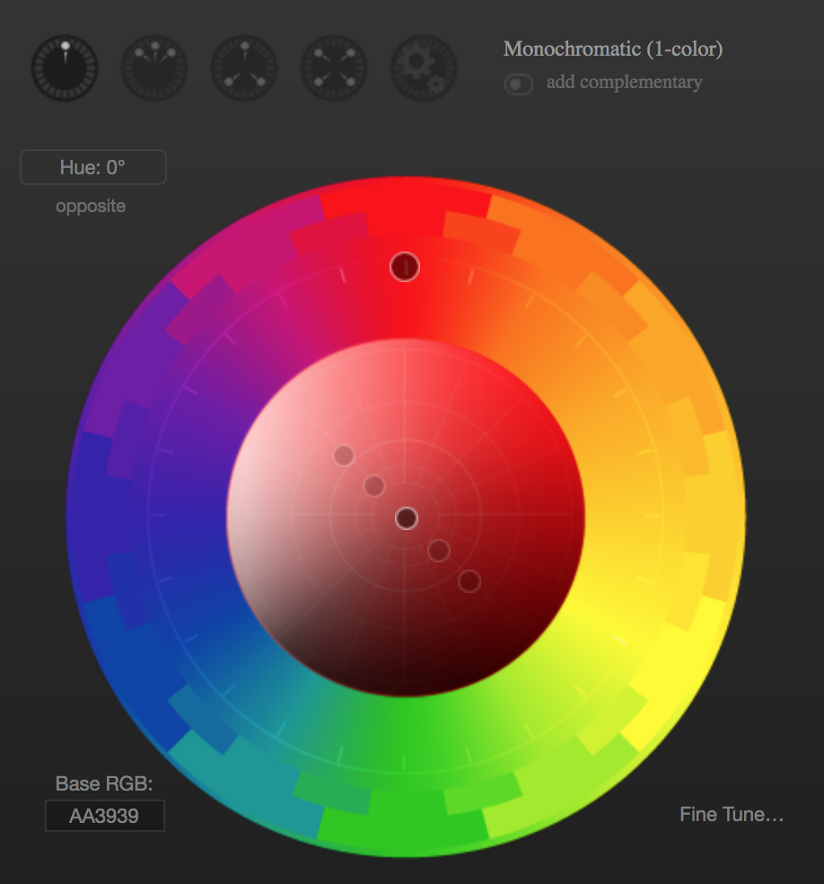
10:15 Color Tool Overview – Paletton and / or The Picture Element
Around 1 in 12 men and 1 in 200 women have some form of color blindness. People with color blindness (also knows as Color Vision Deficiency) face daily usability and accessibility challenges with websites and webapps everyday. Common Terms:
- Red deficiency & Green deficiency (there are 4 types)
- deuteranomaly is when greens look more red
- protanomaly is when red looks more green
- protanopia & deuteranopia difference between red and green is not possible
- Blue / Yellow deficiency
- Tritanomaly makes it hard to tell the difference between blue and green, and between yellow and red.
- Tritanopia makes you unable to tell the difference between blue and green, purple and red, and yellow and pink. It also makes colors look less bright.
Paletton is a really useful tool to help with inspecting and planning colors for web projects. We’ve got a little time this morning so let’s take a look at some ways you can use this tool.
HTML 5.1 the Picture Element
The <picture> element is a lot like the <audio> and <video> elements – very semantic. This is an easy element to use but not used as much as it should be.
Using the <picture> element, we can call up several different images and have them resize and change within that element.
<picture>
 <source media="(min-width: 650px)" srcset="images/food.jpg">
 <source media="(min-width: 465px)" srcset="images/car.jpg">
 <img src="images/girl.jpg" alt="girl taking a photo outside">
</picture>
According to this code:
- An image of a girl will show up as default and for screens smaller than 465px
- When the screen is larger than 650px and image of food will be displayed
- When the screen is between 465 – 649px an image of car will be displayed
Let’s do a quick sample together in CodePen.
Lastly, why do we care?… about the <picture> element
10:35 Break

10:45 English with Mx. Yopp

11:30 Navigation Basics
Navigation is essentially nothing more than a list of links. Links can go to other pages or as we saw with using IDs, we can navigate to other sections on the same page by linking to those IDs (remember the smooth scroll CodePen). We’ll do some basics today and scale up later this week.
<nav>
 <a href="#home">Home</a>
 <a href="#news">News</a>
 <a href="#contact">Contact</a>
 <a href="#about">About</a>
</nav>
The example above will produce a horizontal row of links. Using the semantic HTML5 element <nav> means we don’t have to use an unordered list. Less to code!
Let’s go to CodePen and have a go at some custom Navigation. You can use the code above as a starting point. The code below is just some suggestion for a basic nav.
nav a {
 display:block; /* comment on and off this line */
 background-color: gold;
 text-decoration:none;
 text-align:center;
 margin:10px 0px;
 padding: 10px 0px;
}
Flexbox to the rescue!
With the addition of Flexbox to CSS, navigation has gotten even easier. For a flexible / responsive nav bar, just make sure you have a containing element. In this case the <nav> element is our containing element.
nav {
display:flex;
flex-direction:row; /*you don't actually need this line*/
flex-wrap: wrap;
}
Let’s use some flexbox built in properties to try some other layouts. Let’s add:
justify-content: center; /*also try flex-start, flex-end, space-around and space-between */ /* Then let's add some style to the anchor tags */

nav a {
padding:15px;
text-decoration:none;
background-color:gold;
text-align:center;
}
nav a:hover{
background-color: #efefef;
color: dodgerblue;
}
/* for fun, add transform: rotate(15deg); to the hover state */
Let’s go a bit further and add in the CAWD logo and a <header> because most often the navigation is found in this element. We’ll also add a button too.
Activity #1:
In Codepen, Recreate the top nav menu on this website https://trentwalton.com. Name it CopyThatNav. When complete, drop your link in this CodePen dropbox. Let’s see how close you get!
A link to a pile of creative CSS only (mostly) modern navigation approaches.
A little code bonus for transition effect on bottom border using Pseudo Classes
a:after {
  content: "";
  position: absolute; /*make sure to put relative on the nav a */
  width: 150px;
  height: 3px;
  top: 100%;
  left: 0;
  background-color: #fddb3a;
  transition: 0.5s ease;
  transform: scaleX(0);
  transform-origin: left;
}

a:hover:after {
  transform: scaleX(1);
  transform-origin: left;
}
12:15 Lunch
12:45 Literacy in Practice
1:10 Break

1:20 20% Production Time & Guided Support
- The Good, Bad and Ugly Website – Mobile First Approach – December 8th
- Famous Photographer’s Research Project – December 8th
- CopyThatNav Codepen
- 20% For Week 14 – is now assigned