Class hours: 9:40 – 2:05
Mr. Bohmann
wbohmann@ewsd.org
Today’s Notes
- Today is an EHS B Day
- CCV Class tomorrow – meet in the lobby at 9:15
- One more week to Thanksgiving
- Chocolate Sweatshirt
- Sweatshirt Designs: Arson & the Dans – place a screenshot of your design in Public Folders
9:40 Attendance
9:45 Graph of the Week
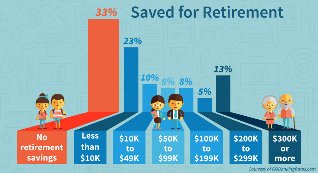
Graph of the Week in Google Classroom
10:00 Flexbox Challenges…..
Open Codepen, Name it Flexbox Challenge
10:15 Figure and FigCaption Test Drive (Elements you might not be too familiar with)

The figure element is intended to be used in conjunction with the figcaption element to mark up diagrams, illustrations, photos, and code examples (among other things).
For the most part, you have just added the <img> element for showing an image. However, there is another way that allows you to get a caption for your images AND give you more styling hooks AND is more semantically correct.
The <figure> element is followed by the <img> and then the <figcaption>. One thing to keep in mind is some elements have some baked in CSS (we saw that with the <blockquote> element.
Let’s build a little project to see how this all plays out. Codepen will be the perfect sandbox.
Create an h1 with the title Figure and Figcaption. Then, let’s make the following:
- Image Without Using Figure Element
- Image With the Figure Element
- Image With Figure & Figcaption
- Multiple Images Within the Figure Element
- Multiple Images with their own figure and figcaption then set in a container with flex
10:35 Mask Break
10:45 CSS Grids
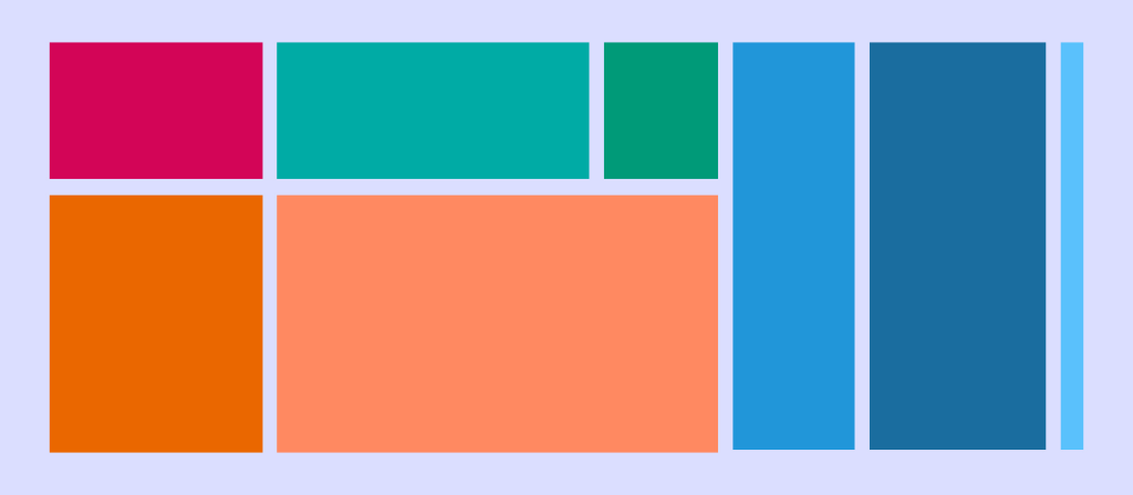
CSS grid layout or CSS grid is a technique in CSS that allows web devs to create complex responsive web design layouts more easily and consistently across browsers. The layout above is very easy to accomplish with Grid!
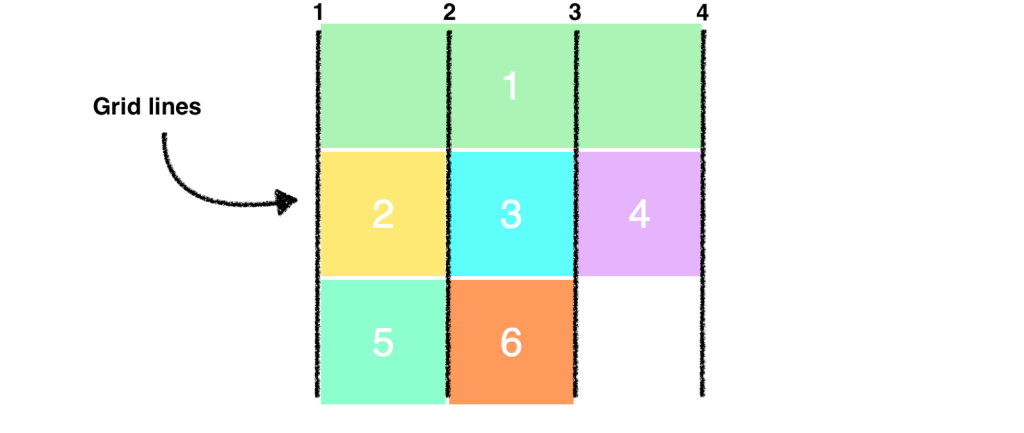
CSS Grid Property Terminology to Know
- display: grid (you’ll need a container)
- grid-template-columns: (for setting number of columns)
- grid-template-rows (for setting rows) [explicit grid]
- grid-gap (for setting the gap between the grid areas)
- nth-child ()
- fr (stands for fraction, can be used instead of percentage)
- minmax (for setting height min and max or width min and max)
Let’s jump into our SandBox in Code Pen and call it – Intro to CSS Grid
We’ll create a basic layout.
Activity: Create a CSS Grid of your own. Be unique.
- 9 divs inside a container (use the section element as your container).
- Set up like a series of Post It Notes (color is nice)
- Each note (or div) will be a personal or professional goal
- Vary the sizes of your notes using grid, position them as you like
- Challenge: use custom fonts and font sizing
- Challenge: change grid-template-rows to grid-auto-rows (what happens? You can now overlap!
- Challenge: include images
- Challenge: Make them flip (https://www.w3schools.com/howto/howto_css_flip_card.asp)
FTP the entire folder with your .html and css to the server. Filename:CSSGrid_PostIts
The Post-Its project is due Friday (this week)
12:15 Lunch
12:45 Some Skinny Lesson
1:10 Mask Break
1:20 Project work time and Guided Support
Trading Cards
Parallax Webpage
CSS Grid Post-its