Class hours: 10:05 – 2:45
Mr. Bohmann | wbohmann@ewsd.org
10:05 Today’s Notes & Attendance
Today is a CTE Blue Day
- PE – badminton in the Gym. Meet there
- CCV Python – taking bus to CCV per usual tomorrow – meet at 9:55
- CCV Drawing – class meeting in the DCM classroom at 10:05am Friday
- FIreDrill tomorrow at 10:15 for those in the building – follow DCM students
- Dec 13: 12:00 – 2:00 Seniors! Come meet with Soren from VSAC to start your FSA ID for the FAFSA and your VSAC Grant application – see Ms. Charron for details.
10:10 Skills USA – Interest Intake

At the start of the new semester we’ll begin (officially) with the technical work / competitions for Skills USA. You’ll have the choice of doing Animation, Web Design or Game Dev track. There are other competitions like Photography and Video Production that students have participated in. If you feel strongly about another technical competition, place that information in the “other” section in this survey.
10:15am Responsive Typography
Responsive Design consists of three characteristics:
1. Media Queries
2. Images that Resize
3. Fluid Layouts (using Grid, Flexbox or % for widths)
As our screens change size, so can the fonts. We don’t have to guess what the right typography is. We can use some simple tools to help make sure that no matter what our screen size is or what font size we want to use, we can have it work together.
Typography can also be responsive. First, let’s get an understanding of the basics.
Absolute Length Units
Absolute length units are considered absolute because they are not relative to any other element. These units will not scale to browser size and will always remain the same size. These include the following:
pt – points
px – pixels
in – inches
cm – centimeters
mm – millimeters
pc – picas
Pixels are really the only absolute CSS length unit we should consider using for the web. The others are mostly used for physical (not digital) measurement (like print). A pixel unit refers to the size of one “dot” of your device display (which will vary slightly with each device). Because of this, pixels are commonly used for things that don’t necessarily need to scale with browser sizes.
Relative Length Units
Relative Length units are considered relative because they change/scale depending on the length of other elements. One common example is percentage, which is dependent on the length of the parent element.
em – relative to the element’s font-size
rem – relative to the root element’s font-size
vw – relative to 1% of your browser’s viewport width
vh – relative to 1% of your browser’s viewport height
vmin – relative to 1% of the smaller of the two browser viewport dimensions (height or width). vmin uses the ratio of the smallest side. That is, if the height of the browser window is less than its width, 1vmin will be equivalent to 1vh . If the width of the browser is less than it’s height, 1vmin is equivalent to 1vw .
vmax – is the opposite. vmax uses the larger of the viewport width or height to set the size.
% – relative to 1/100 of the parent element’s width.
All of these units are used for the web. Want to see an example of all of these in action and understand the difference between em and rem- Fork my CodePen so you have a reference for yourself.
Using Modular Scales

Modular Type Scales
You’ve heard of musical scales, well the same concept can be applied to typography. Modular Scale typography grows and shrinks based on a ratio. Using a ratio allows the type to look consistent and related.
Some sites do better with large type and contrasting sizes better than others sites…
For example, product sites, shopping sites, news sites and commerce sites tend to do better with smaller changes in type size. BBC HappySocks
Marketing sites (like Apple for example) tend to use large type sizes and show great range in the type size variation. Apple RedBull
Let’s play around with type scale. A nice tool is type-scale.com and another one is modular scale. Both do the same thing – they are tools to help you get consistent type.
Using a Scale = Consistency in Design!
Let’s practice. Fork this CodePen and we will apply some type scales to the html elements.
10:50 Break

11:00 Variables in CSS and Custom Properties
Clean code is always a good goal to work towards. To reduce redundancies in your CSS you may want to learn about creating variables. I had a professor use the term DRY out your stylesheets (Don’t Repeat Yourself)
Clean code is always a good goal to work towards. To reduce redundancies in your CSS you may want to learn about creating variables. I had a professor use the term DRY out your stylesheets (Don’t Repeat Yourself)
See how annoying it is to have something repeat!
You might have seen custom properties when inspecting a page. They usually begin like this in your CSS Stylesheet:
:root {
--color:red;
--font-size-large: 2rem;
}

p {
color: var(--color);

.specialtext {
font-size:var(--font-size-large);
The CSS syntax for creating a variable is as follows: var(–name – value)
Where you place your variables matters. They follow the cascade in Cascading Style Sheets (CSS)!
We can create both global variables – defined in the :root and we can also change them at the element level
:root {
  --bg-color: #fff;
  --main-color: #000;
  --secondary-color: #222;
}
/* Elements inherit variables from their parents. */
body {
  background-color: var(--bg-color);
  color: var(--main-color);
}

/* Elements can define their own values and variables, overriding inherited ones.*/
body.dark {
  --bg-color: #080808;
  --main-color: #fff;
  --secondary-color: #ccc;
}
Let’s tackles some basics with variables while also improving our code from earlier where we worked with type scales.
ProTip: You may want to use the type scale variables with your projects. Consider saving this snippet.
Putting it All together….
Now that we’ve done a little work with type scales and css variables (also known as custom properties) the next thing naturally is to put them together with another specification – called CSS calc.

Calc is a newer specification which allows you to do Math calculations in your CSS. Math, why would you want to do math?
- Works well with: length
- Works well with: time (animations & transitions)
- Works well with: numbers and integers (like font sizes, margin and padding)
- Addition +, Subtraction -, Multiplication *, Division /
- Can use with different uses (like subtract 25px from 40%)
- Great for setting Type Scales
- Lastly, showing math is easier to understand when you see it in the code
The real power of Calc() is the ability to mix units! For Example:
transform: rotate(calc(10deg * 5)); or width:calc(1em – 25%);
CSS Calc really works well when setting a type scale for your projects. I encourage you to save this snippet from the work we do in this next demo – where we create a flowing type scale. Fork this codepen and name it CSS Calc With Custom Type Scale. This is a really handy set of variable to have for any project. In this demo we are going to show the math on how the font sizes are derived and then turn this all into root level variables.
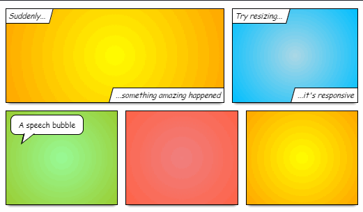
11:50 CSS Grids Team Project
.
House Stark
- Jerry – Project Manager
- Ariel – Artist Designer/Story
- John – Coder
House Lannister
- Richard – Project Manager
- Alex – Coder
- Xavier – Artist Director
House Mormont
- Aiden – Coder
- Philip – Project Manager
- Sparky – Coder
- Andrew – Creative Director
House Targaryen
- Logan – Coder
- Nick – Project Manager
- Finn – Creative Director
House Baratheon
- Kevin – Coder
- Josh – Creative Director
- Brodey – Project Manager
12:25 – 12:55 Lunch

12:55 Independent Reading

1:20 Break

1:30 Design Challenge

1:55 Production Time and Guided Support
- Famous Photographer – Due Monday
- Good Bad & Ugly Responsive Design – Due Wednesday, December 13th
- CSS Grid Comic – Team Project – Due Wednesday, December 13th
- SkillsUSA survey
2:40 Dailies

Dailies can be placed in the CAWD2 Dailies Folder on the CAWD2 Public Folders drive