Class hours: 10:05 – 2:45
Mr. Bohmann | wbohmann@ewsd.org
10:05 Today’s Notes & Attendance
CSS Grid Challenge – Show me your challenge this morning
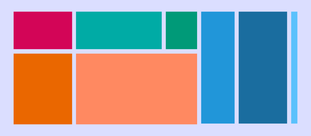
Popular Layout Options: 960 Grid which is a concept of making websites 960px wide and then dividing up the 960 pixels into 12 columns (60px each). But we can do the same thing with CSS Grid. Link to a great website on all things CSS Grid – it is everything you need to learn CSS Grid Layout.
Color picker extension – google one and add to your chrome toolbox or try this one
Food Drive – Keep the food coming
Visitors today (5 minute rotations) – Those working with visitors:
- Nick
- Finn
- Aiden
- Alex
Students that work with visitors will not work with visitors next week.
English – Cancelled today – there will be some work time available
10:10 CSS Grid

Yesterday we looked at how easy it is to set up grid. Just like flexbox we need a container.
- grid-template-columns: (for setting number of columns) (we can use px, % or fr)
- grid-item: To assign our content to those columns. (we declare where to put them with grid-item)
- The rows that are created are a result of the columns or we can declare our rows:
- grid-template-rows (for setting rows) [explicit grid]
- Use gap to create space between your grid (it will not add space on the outside of the grid area!)
- Using nth of type or custom classes is a great way to move items around your grid
Let’s create two common layouts with grid. We’ll do this in VS Code.
- The first layout is called a Pancake layout. It is an excellent choice for mobile and for desktop. Using height on the container will push the footer nicely to the bottom of the page.
- The second layout will be a typical web layout with the header taking up the top, the main taking up two thirds with a sidebar and a footer that extends across the bottom.
- Remember, you can use flex and grid inside any of these layouts!
Let’s get started with a folder. Name it CSS Grid Examples.
- Inside create two html documents
- pancakegrid.html
- tradgridlayout.html
- Create a CSS folder and name them and link them accordingly
- tradgridlayout.css
- pancakestyle.css
- Don’t forget to add the Title in your head element so you know what you are working on!
Pancake Layout
To create this layout, we can make three rows by using grid-template-rows: auto 1fr auto. The second row with a value of 1fr will expand as much as it can, whereas the other two only have enough space by wrapping their content. Let’s make a header, nav, main and footer. We’ll use some content on the web for this: https://www.healthyhabitsvt.com/
.container {
  display: grid;
  height: 100vh;

  grid-template-rows: auto 1fr auto;
}
Traditional Layout
The traditional layout we’ll create will have a header, nav, main, aside and footer. By placing on the grid, we can reorganize and change layouts easily for mobile and desktop. We’ll focus on the layout today and then can consider some modern styling options down the road.
.container {
    display: grid;
    grid-template-columns: repeat(12, 1fr);
}
header{
grid-column: 1 / span 12;
}
nav{
grid-column:1/13;
}If you enjoy grid, check out 1linelayouts and the video. Great explanation of easy grid layouts.
10:50 Break

11:30 Visitors Arrive – Production – Grid Practice

11:55 Grid Review or Production Window
12:25 – 12:55 Lunch

12:55 Independent Reading

1:20 Break

1:30 Design Challenge

1:55 Production Time and Guided Support
- Parallax Website – now overdue
- Famous Photographer Assignment – due Monday
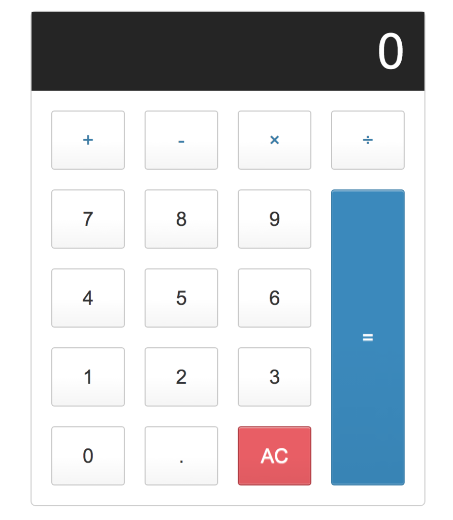
- CSS Calculator – show me when complete
2:40 Dailies

Dailies can be placed in the CAWD2 Dailies Folder on the CAWD2 Public Folders drive