Class hours: 10:05 – 2:45
Mr. Bohmann | wbohmann@ewsd.org

10:05 Today’s Notes & Attendance
- Today is a Wacky Wednesday
- Call Backs: – John (Public Issues), Andrew (Science) 12:50pm
- Colchester HS has early departure at 11:45am – only if you take the bus(Xavier, Philip)
- CCV Classes on Friday – Lunch Form
- Today we will have 2 visitors working with us from 11:00-11:30. They will rotate after 10 minutes, so you won’t have to do too much with them for too long.
- Station #1: Jerry
- Station #2: Josh
- CCV Drawing students – class will meet in the DCM classroom at 10:05am on Friday
- Fire Drill on Friday at 10:15am – Just letting you know
- Solution to Calculator
10:10 Responsive Design
This week and last week we tackled CSS Flexbox and CSS Grid. Both modern approaches that provide improved ways to create web pages and lto ayout web content.
Both options also allow for lots of flexibility for changing the design without heavy code changes.
Today, we’ll begin to look at Responsive Design. Responsive design allows web developers to improve the web experience by designing for multiple screen sizes. And there are many.
Responsive Design consists of three characteristics:
- Media Queries
- Images that resize
- Fluid Layouts (using Grid, Flexbox or % for widths)
There are two schools of thought about responsive design:
- Mobile First
- Desktop First
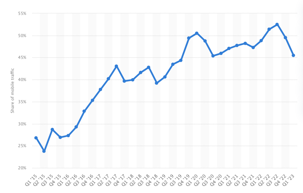
In 2015 Mobile web traffic made up about 26% of web traffic world wide. In 2022 mobile traffic hovered over 50%. So, given the graphic, what responsive design school of thought should we begin to adopt?
Responsive Design: Characteristic #1 Media Queries
The Viewport Meta Tag: gives the browser instructions on how to control the page dimension and scale. This code should go in every <head> element of your html web pages
<meta name="viewport" content="width=device-width, initial-scale=1.0">width=device-width set the width of the page to follow the screen width of the device
What makes a layout go from fluid to responsive is the use of Media Queries
@media screen and (max-width:  1000px) {
     p {
          font-size: 24px;
       }
}

/* The @media is the media rule */
/* Screen is the media type. */
/* (max-width: 1000px) is the media feature */
/* What this query means is when the browser viewport is smaller than 1000px, apply this block of CSS
If this condition is not met, then this CSS is ignored */

/*There are 4 Media types:  all, print, speech and screen */
School of Thought #1 Mobile First
A mobile first approach means writing your CSS to cater to smaller screen sizes. Media queries are then used to make changes for bigger screens. This approach usually uses min-width media queries.
School of Thought #2 Desktop First
When writing CSS, you write for the desktop and then add media queries for smaller screens. This is probably the more familiar practice to you and the one you likely did last year. This approach usually uses max-width media queries.
Using min-width (mobile first approach) features are added at each breakpoint
// Small devices (portrait phones, 375px and up)
@media (min-width: 375px) { ... }

// Small devices (landscape phones, 576px and up)
@media (min-width: 576px) { ... }

// Medium devices (tablets, 768px and up)
@media (min-width: 768px) { ... }

// Large devices (desktops, 992px and up)
@media (min-width: 992px) { ... }

// Extra large devices (large desktops, 1200px and up)
@media (min-width: 1200px) { ... }
Using max-width (desktop first approach – and what you are probably used to)
@media (max-width: 575.98px) { ... }

// Small devices (landscape phones, less than 768px)
@media (max-width: 767.98px) { ... }

// Medium devices (tablets, less than 992px)
@media (max-width: 991.98px) { ... }

// Large devices (desktops, less than 1200px)
@media (max-width: 1199.98px) { ... }
Activity:
Today we’ll do a coding walk-through of setting up a responsive page to refresh your memory. Let’s start with the Mobile First approach. Please download my sample files, unzip and open in VS Code.
10:50 Break

11:00 Visitors (2) & Responsive Design Practice
Practicing Media Queries: The Good, The Bad, The Ugly

Begin a Mobile First approach to designing your webpage.
To get started:
- Create a folder on your Desktop and name it: ResponsiveDesign
- Inside create a css and images folder
- Use the inspector and adjust your page size to 375px. Begin your styling here.
What to Do (Deliverables): Build a webpage that changes as the screen size changes.
We’ll call this assignment The Good, The Bad and The Ugly
Your website will include:
- H1
- 1 Good Guy image with paragraph
- 1 Bad Guy image with paragraph
- 1 Ugly image with paragraph
- You are going to want to learn about display:block and display:none! see below
- When you design for the small screen, chances are your design is minimal, but keep in mind that when you get to the big screen, there is a lot of space to fill. Style accordingly.
Default starting point is Ugly (this is on your smallest screen size)
376px to 767px = Bad (we should see your bad guy here )
768px and larger = This is where we see your good guy image
Check your HTML and CSS for Validation. Copyrighted images are ok for this assignment.
FTP the entire folder to the server when you are complete. This project is due on Wednesday, December 13th.
Hide an Element – display:none or visibility:hidden?
- Hiding an element can be done by setting the
displayproperty tonone. The element will be hidden, and the page will be displayed as if the element is not there: visibility:hidden;also hides an element, however, the element will still take up the same space as before. The element will be hidden, but still affect the layout.display:blockwill unhide and element
11:35 CSS Grids Team Project
CSS Grid Comic – Each team will have 3 members.
Your Goal: Work as a team. Create a Comic. Output using CSS Grid for layout
- Project Manager / Problem Solver / Scrum Master- The project manager is the organizer, the speaker for the group and the one person I will count on to give me an update and for keeping the project in scope. This person is going to keep the project moving, on time, in scope and will help out the other two roles as needed.
- Artistic Director / Story Creator / Creative Director– responsible for the paper mock up of the comic, color palette and creative aspects of the design. Document your creative inspirations.
- Front End Coder – your job is to take the design from the artistic director and turn it into the code necessary to complete the project. HTML / CSS and full validation. Strong and creative coders. Responsible for files/publishing
This is a team deliverable project. Everyone should be working – all the time! You will have (3) 45 minute work sessions. (Today, Tomorrow and next Wednesday).
Project is due on Wednesday, December 13th by End of Day. Project Managers will present the project on Thursday.
To be successful, you do not have to wait for a design to code. Just follow the deliverables:
- An original comic (9 different size panels). You may draw your comic and upload the images or create a digital version of the comic.
- Layout using CSS Grid
- FolderName: CSSComic
- css Folder
- images Folder
- index.html
- A wireframe / layout of the comic with details /art for each panel
- You may go analog or digital for your wireframe and story
- Custom font(s)
- One breakpoint at 480px for mobile devices (look it up if you don’t know how to do this)
- Valid HTML and CSS (1 point off for each error)
- Published to each members server – exact filenames please
Inspirational CSS Grid Designs
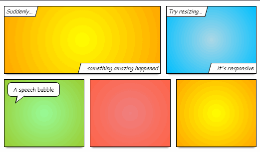
speech bubbles and text can be organized using FlexBox
House Stark
- Jerry – Project Manager
- Ariel – Artist Designer/Story
- John – Coder
House Lannister
- Richard – Project Manager
- Alex – Coder
- Xavier – Artist Director
House Mormont
- Aiden – Coder
- Philip – Project Manager
- Sparky – Coder
- Andrew – Creative Director
House Targaryen
- Logan – Coder
- Nick – Project Manager
- Finn – Creative Director
House Baratheon
- Kevin – Coder
- Josh – Creative Director
- Brodey – Project Manager
11:55 Lunch
12:25 Independent Reading
12:50 Break
1:00 Production Time and Guided Support
1:50 Dailies
Dailies can be placed in the CAWD2 Dailies Folder on the CAWD2 Public Folders drive