Class Hours: 10:05 – 2:40
Mr. Cronin
Notes
- Friday!
- I don’t care what you do, but go sledding or skiing or snowboarding or a hike or throw a snowball or do something outside. SOMETHING.
10:05 Attendance and Article
10:10 VR / AR

Kit handouts to teams!
Brand new, never been turned on, please treat as if your own.
- need to setup …… ?
- charge?
- figure out what is needed to setup the Quest 3 with a Meta account? Do whatever you need to (just don’t break any laws) so that everyone can use it
Work collaboratively. The machines are not “anyone’s” over in our VR/AR studio, anyone can use any of them. Don’t hog. We are all moving in the same direction.
Remember we are working as colleagues as compared to competitors. If all of a sudden Isaiah “gets it” and leads his team to success in Milestone 1, there is nothing wrong with Isaiah pushing other teams in the right direction. A rising tide raises all boats.
Milestone 1

- Get the Quest 3 working with the VR Template Project
- Have all 4 team members jump in and and understand how to manipulate the world and their location using the controller grips
- Have what the person in VR/AR sees show on one of the monitors so people can take part in the process beyond having the goggles on
10:50 Morning Break (10 minutes)

11:00 English

11:55 VR / AR
At the END of a day in AR / VR everything needs to be turned off, packed away, and stored smartly. No mess.
12:25 Lunch

- No food in the room / eat in the Cafe.
- You are welcome to return to the room when you have finished eating and work / hang out.
12:55 Attendance and Article
1:00 A Gentleman in Moscow
1:00 Steve Jobs
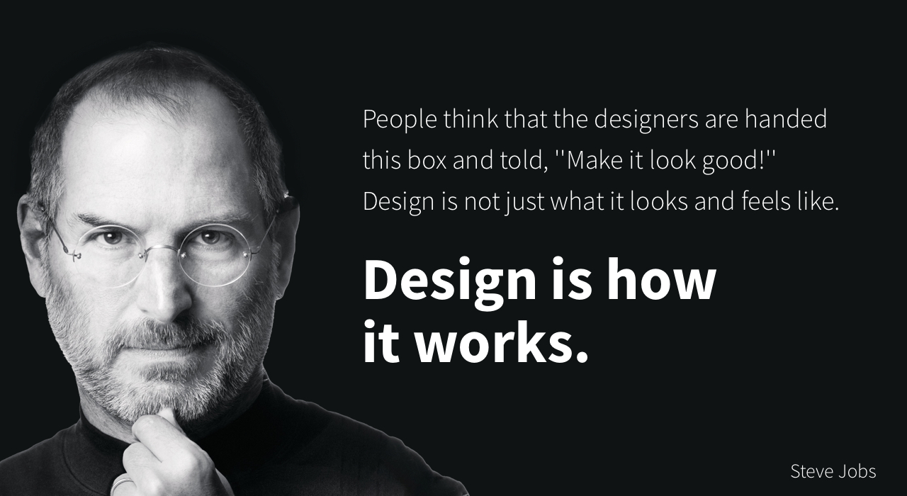
Based on more than forty interviews with Steve Jobs conducted over two years–as well as interviews with more than 100 family members, friends, adversaries, competitors, and colleagues–Walter Isaacson has written a riveting story of the roller-coaster life and searingly intense personality of a creative entrepreneur
Read along with Mr. Cronin. Improve literacy, word decoding, enjoy a nice story, and unplug from the world.
1:20 Afternoon Break (10 minutes)
1:30 Speed Design

Speed Designs are 10 minute sprints in CAWD where we practice. It could be any medium – 3D, 2D, video, programming, etc.
1:45 Afternoon Practice & Production
DH17: Single building from worms eye view in 3 Point Perspective
- lastNameDH_17.jpg
Week 17 Agency
- lastNameAgency_1.jpg through lastNameAgency_3.jpg
2:15 Dailies

2:20 “19 Minutes”
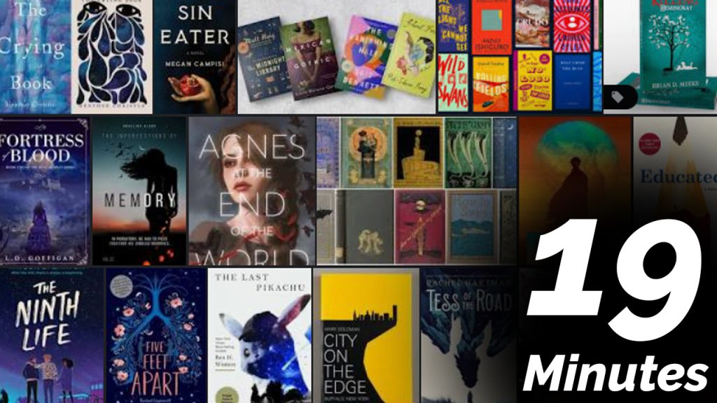
4 of 5 days per week we will end our day in CAWD with the “19 Minutes” of silent reading. Closing down our day with silent reading provides many benefits:
- Improve Literacy Skills / Reading Stamina
- Create space for a small reading meditation where we can disconnect from the world and get lost in a story
- Unplug
At 2:39 each day I will come to 3 students and ask for a 1 sentence explanation of what happened in your story over that day’s reading session. It is neat to hear little pockets of a story, here and there.
2:40 Dismissal