Class Hours: 10:05 – 2:40
Mr. Cronin
Notes
- Thursday!
- Remember that we are hosting pre-tech students today while you are in English, please log out of anything you don’t want people snooping in.
10:05 Attendance and Article
10:10 Pin Work Time
Today we are going to start working on some design elements that are showing up in this pin, just to see what we can create together.
We will start with text – required text for the design is:
- SkillsUSA
- Vermont
- 2025
Let’s download a custom font. Let’s play with some text warping? Let’s see if we can get to this point today:

10:35 Outdoor Game Environment

Check back to the Tuesday Dayplan for Specifics.
10:45 Copy 2 asses to desktop for use…
10:50 Morning Break (10 minutes)

11:00 English

11:55 Outdoor Game Environment
Check back to the Tuesday Dayplan for Specifics.
12:25 Lunch

- No food in the room / eat in the Cafe.
- You are welcome to return to the room when you have finished eating and work / hang out.
12:55 Attendance and Video
1:00 A Gentleman in Moscow

A Gentleman in Moscow is a reader’s dream — a wonder-full, nuanced story full of wit, insight, and imagination.
Read along with Mr. Cronin. Improve literacy, word decoding, enjoy a nice story, and unplug from the world.
1:20 Afternoon Break (10 minutes)
1:30 Speed Design

Speed Designs are 10 minute sprints in CAWD where we practice. It could be any medium – 3D, 2D, video, programming, etc.
1:45 Afternoon Practice & Production

Outdoor Game Environment
- lastNameExterior.mp4
DH14: Perspective Art with Alcohol Markers
- lastNameDH_14.jpg
Week 14 Agency
- lastNameAgency_1.jpg through lastNameAgency_3.jpg
2:15 Dailies
2:20 “19 Minutes”
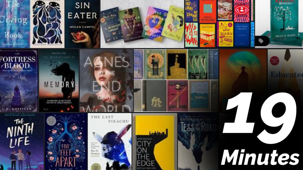
4 of 5 days per week we will end our day in CAWD with the “19 Minutes” of silent reading. Closing down our day with silent reading provides many benefits:
- Improve Literacy Skills / Reading Stamina
- Create space for a small reading meditation where we can disconnect from the world and get lost in a story
- Unplug
At 2:39 each day I will come to 3 students and ask for a 1 sentence explanation of what happened in your story over that day’s reading session. It is neat to hear little pockets of a story, here and there.
2:40 Dismissal