Class Hours: 10:05 – 2:40
Mr. Cronin
Notes
- South Burlington Visit day #1 – in afternoon. We ARE going to have visitors from.
- 12:45 – 1:15
- Students working as guides
- Jacob
- Terrain and Foliage tool?
- Students working as guides
- 1:45 – 2:15
- Students working as guides
- None as of now…
- Terrain and Foliage tool?
- Students working as guides
- Early lunch and wacky schedule – lets check the schedule.
- 12:45 – 1:15
- Rest of the week:
- Wednesday – Visitors from CTE in the morning 10:30 – 11:30. We are hosting 8 visitors.
- Husdon, MJ, Jacob visiting other programs for next year, be in the cafe at 10:25. (You can go directly there if you know where to go).
- Thursday – Final Pre-tech to CAWD visit. We are hosting. Extra credit!
- Friday – Nothing educational. We go to Movies right at attendance! PM is for chilling. Dayplan posted, review when you can.
- Wednesday – Visitors from CTE in the morning 10:30 – 11:30. We are hosting 8 visitors.
10:05 Attendance and Article
10:10 Pin Design AM in Illustrator

Snowboarder / Skier / Sledder continuation.
We are doing this Tuesday / Wednesday / Thursday as Friday is a fun day.
10:50 Morning Break (10 minutes)

11:00 Unreal

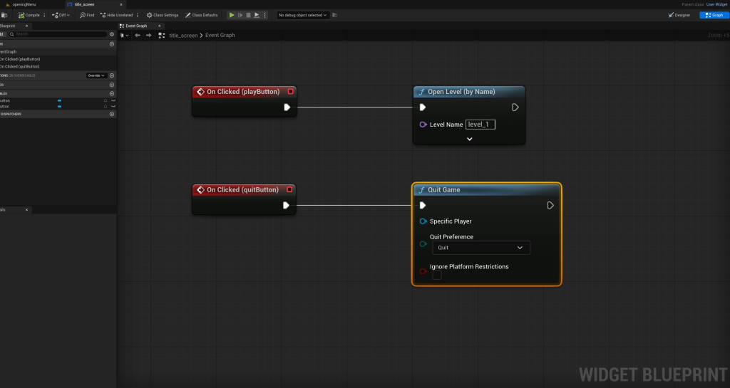
- Dedicated Opening Menu Screen and level
- Clickable buttons – setting input mode to UI only and showing the mouse
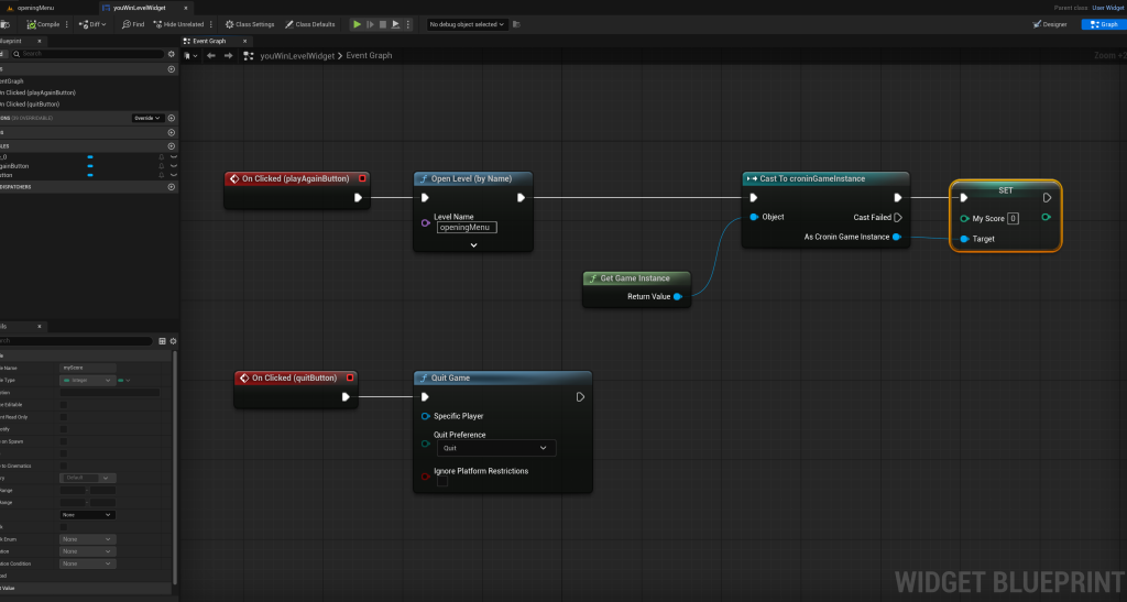
- Dedicated You Win screen and level
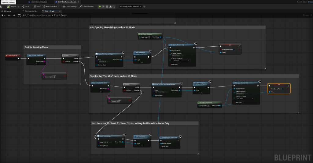
11:45 Multilevel Game with Buttons

This week we are going to take our game and continue to develop it.
The goal at the end of this week is that we have:
- Intro / Title Level with Start / Quit buttons. Brand for your game. When we hit play we go to the…
- Level 1 – on the ground. When we collect 3 pickups we move to …
- Level 2 – in the sky. When we collect 3 pickups we go to a “You win” level and screen. This screen will options to play again or quit.
Demonstrate all of this – the start, and BOTH ways to finish (win or lose). Try to keep this video as quick as you can for presentations sake.
Call your file lastNameMenuButtons.mp4.
At the end of this we are going to have the following levels:
- Opening Level Menu
- level_1
- level_2
- You win level
Consider using an image and your skills in Illustrator to make an interesting Opening Level Menu. Start seeing how all the different strands of CAWD coalesce at the end.
11:55 Preparing for Wednesday and Thursday visitors

Wednesday we are going to host 8 visitors from 10:30 – 11.
Thursday we are going to have a late English and host 9 Pre-tech students from 11 – 11:40.
Here is what we are going to do Wednesday (assume you are going to have them 15-20 minutes)
- Quick intro to shape keys – Make Kirby Jump up and down being happy. You just do it and explain what you are doing.
- Then we have you show off your current game and best projects.
Here is what we are going to do Thursday (assume you are going to have them 40 minutes)
- Quick intro to shape keys – Make Kirby Jump up and down being happy. You are TELLING them what to do – they are doing the work.
- Then the visitor is going to model something super basic in Blender for the game. Something for foliage? A building? It’s going to be basic. Let them go crazy in Blender and create…. anything. Pickup, rock, random shape, etc.
- Then you guide them to export the asset and bring into your game. However it comes to UE is fine, we just want to demo the workflow of Blender to UE. Add it in as a background item, show them how to use with foliage, just go crazy.
This is meant to be a low-stress-fun-exploration. Nothing we have to use once they are leave, so if they go off the rails, just smile and help.
I know some of you know those students, and we wanted the last pre-tech visit to be a collaboration where you get to work with a current student. Also gives an opportunity for extra credit to a bunch of people. Questions?
English will happen on Thursday in CAWD from 11:45 to lunch, so we have a shorter English AND you get extra credit in CAWD.
12:05 Lunch
- No food in the room / eat in the Cafe.
- You are welcome to return to the room when you have finished eating and work / hang out.
12:35 Attendance and Article
12:45 Afternoon Practice & Production

Multilevel Game with Buttons
- lastNameMenuButtons.mp4
DH16: Single building from birds eye view in 3 Point Perspective
- lastNameDH_16.jpg
Week 16 Agency
- lastNameAgency_1.jpg through lastNameAgency_3.jpg
1:20 Afternoon Break (10 minutes)

1:30 Speed Design

Speed Designs are 10 minute sprints in CAWD where we practice. It could be any medium – 3D, 2D, video, programming, etc.
1:45 Afternoon Practice & Production

Multilevel Game with Buttons
- lastNameMenuButtons.mp4
DH16: Single building from birds eye view in 3 Point Perspective
- lastNameDH_16.jpg
Week 16 Agency
- lastNameAgency_1.jpg through lastNameAgency_3.jpg
2:15 Dailies

2:20 “19 Minutes”
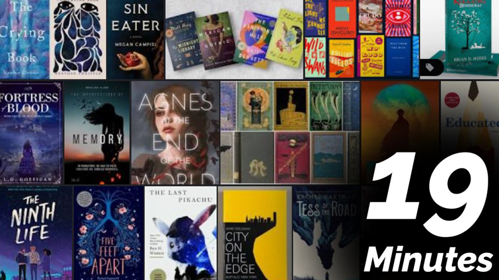
4 of 5 days per week we will end our day in CAWD with the “19 Minutes” of silent reading. Closing down our day with silent reading provides many benefits:
- Improve Literacy Skills / Reading Stamina
- Create space for a small reading meditation where we can disconnect from the world and get lost in a story
- Unplug
At 2:39 each day I will come to 3 students and ask for a 1 sentence explanation of what happened in your story over that day’s reading session. It is neat to hear little pockets of a story, here and there.
2:40 Dismissal
