Class Hours: 9:40 – 1:45
Mr. Cronin
Notes
- Early release Wednesday! Callbacks:
- Maxx to Public Issues @ 12:25.
- Late break today due to hosting some Pre Tech visitors. Lion, Jacob, Caleb, and Trevor will host students and we are going to have them take a crash course on making some terrain and foliage in UE.
10:05 Attendance and Article
10:10 Adobe AM
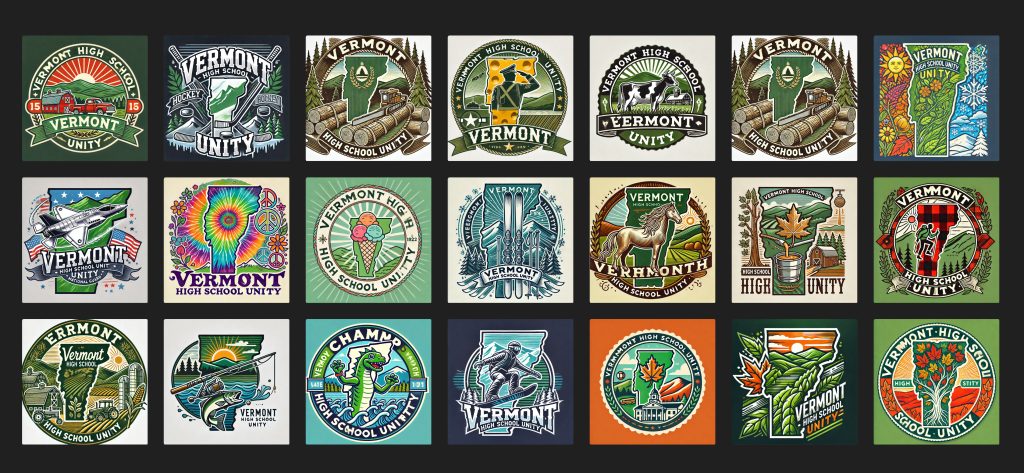
We are going to have a conversation and decide what ONE singular design we are going to create as a class. We will practice making leveraging Illustrator over the next couple of weeks to create an industry ready design.
The best implementation of the design moves on to represent CAWD in the Design Competition at the CTE level.
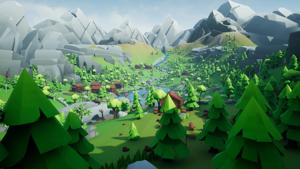
10:30 Outdoor Game Environment / Working with visitors
Check back to the Tuesday Dayplan for specifics.
~ or ~

- Setting up terrain
- Setting up foliage
- Speed run these noobs
11:00 Morning Break (10 minutes)

11:10 Blender -> UE Coin Collectable

- Model pickup in Blender and exporting
- Bring to UE / Fixing UV’s / Adding rotational component
- Sound?
11:55 Lunch
- No food in the room / eat in the Cafe.
- You are welcome to return to the room when you have finished eating and work / hang out.
12:25 Attendance and Video
12:30 A Gentleman in Moscow

A Gentleman in Moscow is a reader’s dream — a wonder-full, nuanced story full of wit, insight, and imagination.
Read along with Mr. Cronin. Improve literacy, word decoding, enjoy a nice story, and unplug from the world.
12:45 Afternoon Practice & Production

Outdoor Game Environment
- lastNameExterior.mp4
DH14: Perspective Art with Alcohol Markers
- lastNameDH_14.jpg
Week 14 Agency
- lastNameAgency_1.jpg through lastNameAgency_3.jpg
1:20 Afternoon Break (10 minutes)

1:30 Afternoon Practice & Production

Outdoor Game Environment
- lastNameExterior.mp4
DH14: Perspective Art with Alcohol Markers
- lastNameDH_14.jpg
Week 14 Agency
- lastNameAgency_1.jpg through lastNameAgency_3.jpg
1:40 Dailies

1:45 Dismissal
