Class Hours: 10:05 – 2:40
Mr. Bohmann | wbohmann@ewsd.org
10:05 Today’s Notes & Attendance
- CCV Class Friday – Lunch order
- College Fair on Thursday
- Resume – I want to see whatever you have – if you don’t have anything, let me know
- Fall Foliage – rain is going to eliminate a lot of leaves – the next is probably the last burst of color. Heading towards Shelburne, Charlotte, shores of Burlington will yield good colors
- 1pm Wednesday – VHV Meeting (Isaac, Joshua, Jackson, Sawyer) -Amanda, Bubba, Josh will read independently in Mr. Cronin’s Room @(1:15pm)
10:10 Monday Mail on a Tuesday – Quick Check

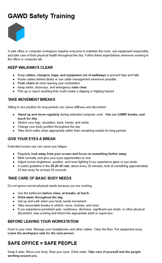
10:15 GAWD2 Safety Training
Safety training as required by the State of Vermont. Let’s review our safe classroom training together.
10:25 Image Manipulation with After Effects
Let’s add a sunset to an image that really needs one. You’ll find this image in CAWD2 public folder/ After Effects Resources / PhotoSpecialEffects folder. The image is called Lake. Place a copy on your desktop.
AE is great for working with images. Exporting images is really easy too. We’ll practice that together.
Blending modes for layers control how each layer blends with or interacts with layers beneath it. Blending modes for layers in After Effects (formerly referred to as layer modes and sometimes called transfer modes) are identical to blending modes in Adobe Photoshop.
Blending Modes in digital image editing are used to determine how two layers blend together. The default blend mode with most image programs is to ignore the lower layer and add whatever is present on the top layer.
Pixels on layers have numerical values. Playing with how you blend layers can have a big impact on your final render. It is good to experiment. Learn by doing and practice, practice, practice.
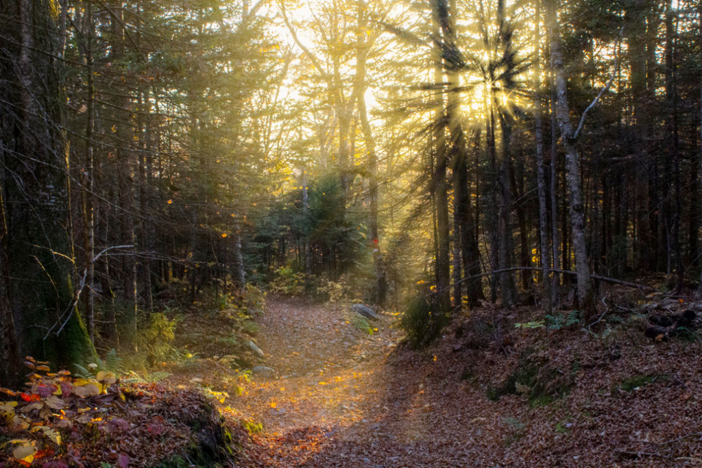
Bolton Valley Hike – Will Bohmann
10:50 Morning Break (10 minutes)

11:00 Color Grading in Adobe Premier
Do you know the difference between Color Correction and Color Grading?
This morning we’ll work in the Color workspace in Premiere, perform some basic Color Correction (fixing white balance, Exposure Contrast) and then apply Color Grading (creating Style) to establish a mood.
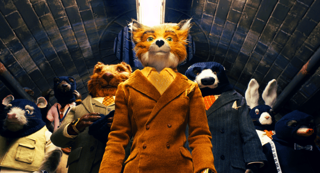

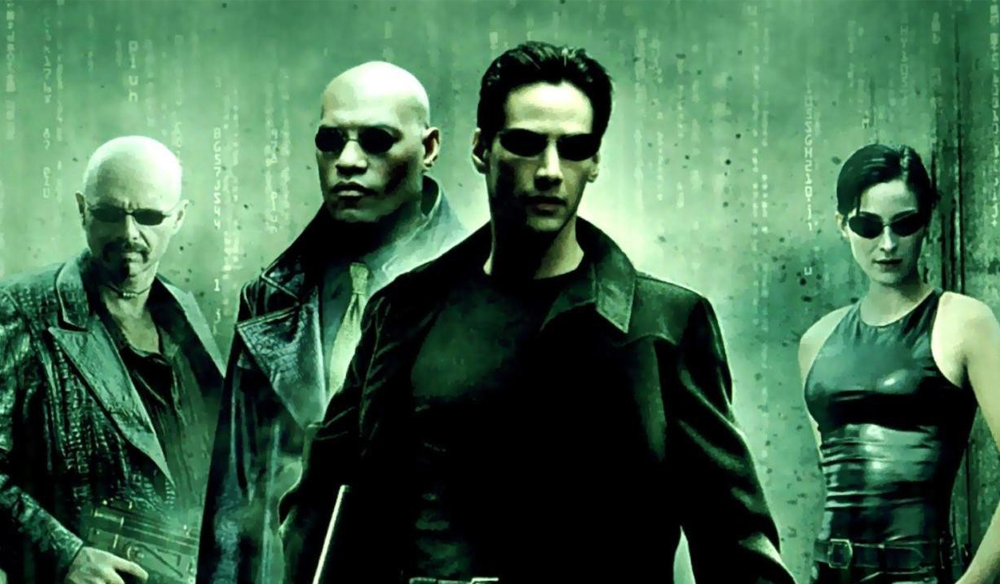
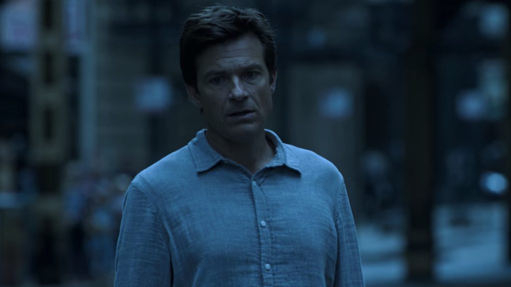
We’ll also learn how to save our own Creative presets for easy editing of other clips.
We’ll do this with adjustment layers.
Some Terms….
- White Balance (Temp/Tint): Correcting color casts to make white look truly white.
- Exposure: The overall brightness of the image.
- Contrast: The difference between the light (highlights) and dark (shadows) areas.
- Hue: The fundamental color itself, often represented on a color wheel
- Saturation: The intensity or purity of colors.
- Brightness: How light or dark the color appears – also referred to as Luminance controls how much black or white is mixed with the color
WorkFlow:
- Set up Adjustment Layer for non-destructive editing of your clip
- Start with Basic Correction (Fixing your Image) – white balance, contrast and exposure
- Apply some creative grading making your own adjustments or using preset looks
Horror Color Grade: Despair & Dread
Key Characteristics of a Horror Grade:
- Desaturated Colors: Often muted, dull, or almost black and white to strip away warmth and life.
- Crushed Blacks: Shadows are very dark, losing detail, creating a sense of hidden threats and gloom.
- Cool Tones: Blues, cyans, and greens are dominant, evoking coldness, sickness, and unease.
- Lack of Warmth: Reds and oranges are usually subdued or completely removed, denying comfort.
- High Contrast (sometimes): Sharp differences between light and dark can create stark, unsettling visuals.
- Vignettes: Darkening the edges of the frame to draw attention to the center and create claustrophobia.
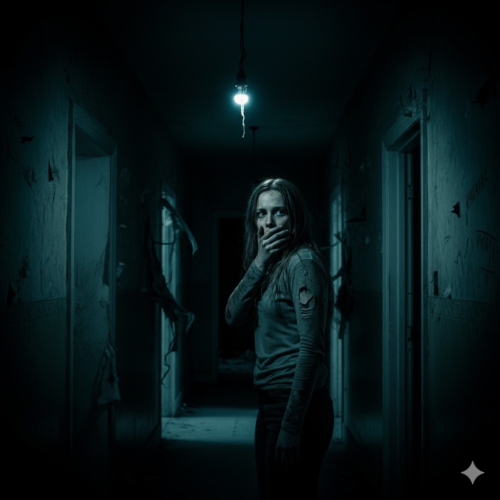
Basic Correction (Desaturation & Underexposure)
- Exposure: Slightly decrease the Exposure (-0.5 to -1.5 usually) to make the scene darker overall. Horror thrives in gloom.
- Contrast: Increase Contrast (+20 to +40) to make the blacks deeper and the highlights more stark.
- Highlights: Slightly decrease Highlights (-10 to -20) to prevent any parts from being too bright and cheerful.
- Shadows: Significantly decrease Shadows (-30 to -60) and Blacks (-30 to -70) to “crush the blacks.” This means losing detail in the darkest areas, which hides threats and creates dread.
- Saturation: Drastically reduce Saturation (-40 to -70). This strips away vibrancy and life, leaving a drab, sickly feel.
Creative (Color Cast & Faded Film)
- Look: Browse through the built-in “Looks” for anything that leans towards cool or desaturated. “SL-Hazy” or “SL-Bleached” can be good starting points, then adjust the intensity.
- Faded Film: Increase Faded Film (30-60). This washes out the image slightly, giving it a dreamlike or decaying quality.
- Sharpening: A slight increase in Sharpen (10-20) can sometimes make edges feel harsher, adding to the unease.
Color Wheels & Match (Adding the Chill)
- Shadows Color Wheel: Drag the wheel towards Blue or Cyan. This injects coldness and a sickly pallor into the darkest areas.
- Midtones Color Wheel: Drag slightly towards Blue or Cyan/Green to reinforce the cold, unnatural feel.
- Highlights Color Wheel: Consider dragging slightly away from warm tones, perhaps even a tiny bit towards blue, or leave it neutral to keep the cold feeling dominant. Avoid adding yellow/orange unless it’s for a very specific “eerie light” effect.
Vignette (Claustrophobia & Focus)
- Go to the Vignette tab.
- Amount: Significantly decrease the Amount (-50 to -80) to create a dark border around the frame.
- Midpoint: Adjust the Midpoint (usually lower, like 20-50) to control how far the vignette reaches into the center.
- Roundness: Adjust Roundness as desired (often slightly negative for a more rectangular dark edge).
- Feather: Increase Feather (80-100) for a soft, natural fall-off of the dark edges.
Other Color Grades To Try
The Crime Thriller (Inspired by Ozark)
Mood Goal: Cold, bleak, morally complex, tense.
Basic Correction:
Temperature: Push left to -25 to -40 for a cold blue
Tint: Shift slightly toward +5 to +10 to keep flat
Contrast: Increase to +20
Shadows: Lower to -15
Blacks: Crush down to -20
Saturation: Desaturate significantly to 50% – 65%
Color Wheels & Match: Drag the center wheel of Shadows slightly toward Cyan/Blue
Sci-Fi Dystopia (Matrix)
Mood Goal: Eerie, Artificial, simulated, uncomfortable
Basic Correction:
Temperature: Slightly cool -10
Tint: push heavy towards green -30 to -50
Contrast: Bump up to hight to +30 to +45
Highlights: Lower slightly to -15
Blacks: Crush down to -25 for sharp blacks
RGB Curves
Select the Green Channel curve and drag the middle anchor point upward to add green
across midtones.
Select the Red Channel curve and pull the middle anchor point downward slightly.
Sterile Corporate Nightmare (Severance / Backrooms)
Mood Goal: Clinical, detached, fluorescent, claustrophobic
Basic Correction:
Exposure: Lift slightly +.3 to +.6 for a bright, over office lit feel
Contrast: Lower to -15 to -25 (flattens image)
Temperature: Push left toward Cool -15 to -25
White: Push up to +15
Saturation: Mute overall color down to 40% – 55%
Curves > Hue Saturation
Hue vs Sat: Click the eyedropper, select warm colors (reds, warm yellows), and pull their
control points down to strip out human warmth while retaining pale teals and blues.
Suburban Horror / Suspense (Obsession, Halloween)
Mood Goal: Golden autumn hues masking deep, ominous darkness.
Basic Correction:
Tine:Adjust slightly toward magenta +5 to +15
Contrast:Increase to +25
Temperature: Warm up heavily +25 to +40 for golden orange tones
Shadows: Drop aggressively -30 to -45
Blacks: Lower to -30 to create heavy shadow pockets
Saturation: boost slightly to 105% to 115%
11:55 Lunch
12:25 Halloween Projection Loop – Group Work Time
Start with a Scrum Meeting with your group
Check your deliverables
Who is your creative director? Does your group have a vision?
1:10 Afternoon Break
1:25 Speed Design
1:45 Agency Shareouts
Let’s look at the those agency projects from last week
1:55 Independent Production & Guided Support
2:10 Dailies

2:15 Independent Reading
2:40 Dismissal