Class hours: 10:05 – 2:45
Mr. Bohmann | wbohmann@ewsd.org
10:05 Today’s Notes & Attendance
Week 11
Thank You – for the card! It means a lot.
Welcome to Week 11 – make those folders
Star Wars Fan Films due on Tuesday – for viewing!
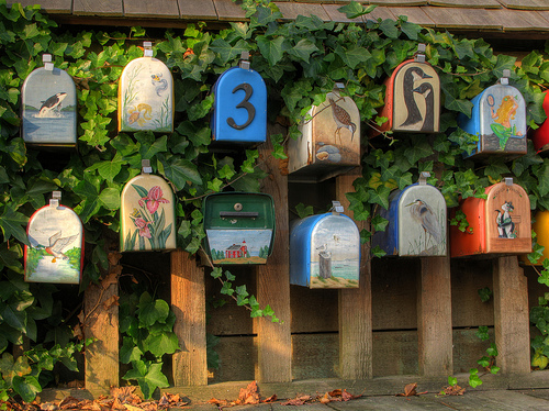
LTA Photography Assignments are due on Wednesday for viewing
A few words about the LTA Photography Project… Due date was November 6th ! Submissions after that date will be marked late and graded accordingly. This is Quarter 2 – it’s time to hit those due dates!

On Wednesday – November 13th, at 11am we’ll look at your photos. Most students find it easiest to turn their slideshow into an .mp4 and press play. If you do that, make sure each slide is visible for 10 seconds. Include your title and meta data on your images. ProTip: Your images should fill the screen and look attractive. (test it)
At the end of your slideshow or when presenting – you may talk about your images and say a few words.
- For Sure: Point out your favorite image / explain why it is your favorite image
- Not A Bad Idea: To share any techniques that you used – we love technical terms!
- Indubitably: Let us know if you have improved as a photographer and why
I will ask you two questions from this group of questions:
- What was a challenge you faced during this project?
- What photography assignment did you enjoy the most?
- How has your study of photography changed how you approach taking photos?
- What type of photography do you enjoy the most?
- Do you plan to continue exploring photography?
- Have you shared any of your learning with others?
We’ll look at a couple sample presentations from last year and also look at the required shot list part of the assignment.
10:10 Monday Mail – Check Google Classroom and PowerSchool
10:15 Jump out of the Bus

We have some mandatory practice today. You won’t need anything. We’ll practice bus evacuation for emergency preparedness.
10:20 Catch up / Fan Film Preparations
To assist you down the road – create a bookmark Folder in your browser – name it WebToolbox and bookmark the following:
- HTML Validation Service
- CSS Validation Service
- JavaScript Validation Service
- WebAim Accessibility Checker
- Developer Tools Overview
- W3 Schools
- Bacon Lorem Ipsum Generator – Because everyone loves bacon!
Then Find and Download the following Programs:
- VS Code
- FileZilla (Pick the FileZilla Client as your download)
- Create an account on https://www.geocities.ws/
- use your first initial and lastname (like: bsmith)
- Take a screen shot of all of your login information and save in your google drive
Then….
Prepare for the LTA Photography Slideshow – Wednesday
or…
Work with your group to prepare for the Star Wars Fan Film viewing for tomorrow
10:50 Break

11:00 English with Mx. Yopp

11:50 – 12:25. New Unit KickOff – The Web Developer
We are moving on from motion graphics and visual effects to Web Development and Design. Have you considered a career in Web?
What do Web Developers do all day? Have a look at common jobs and responsibilities
Over the next Quarter we are going to dive all-in to Web Development & Design.
You’ll see that I’ve set up a KanBan board with a selection of “ToDo’s”. This is our learning backlog. While not the entire list of topics, the backlog is a good overview of work that we are going to tackle.
Each “Done” status will be tied to some assessment of your skills. Some of the topics we’ll cover include:
- Web Design refresher
- Basic HTML & CSS
- Media Management
- SVGs
- Advanced CSS
- Flexbox
- Flexbox Grids
- Calc() & Custom Properties (layouts)
- Custom Variables
- CSS Only Menus
- Modular and Type Scales in Typography
- Mobile First Design
- Content Management Systems (CMS)
- WordPress
- Child Themes in WordPress
- Databases
- JavaScript
- DOM Elements
- HTML/CSS
- Animations
- Event Listening
- Front End Frameworks
- Bootstrap
- Others? Tailwind…
- GitHub
- Version Control
- Push/Pull
- Workflows
- Accessibility
- UX / UI & Usability Testing
Activity: Quick Review – Socrative Review
HTML5 – Modern Web and Semantic Elements – What?
Semantic means relating to the meaning of words and phrases. When working with HTML code and writing classes and ids (remember those?) using semantic terms will make your code a lot easier to read.
Do you know what a generic block level element is called?
Can you think of some HTML elements that are semantic? Let’s make a list
12:25 – 12:55 Lunch
12:55 Independent Reading
1:20 Break
1:30 Design Challenge

1:55 Production Time and Guided Support
Current Assignments:
- Star Wars Fan Film – For Tuesday
- LTA Photography Assignment for Wednesday
- Resume – Upload to Dropbox if you have not already
2:38Dailies
Dailies can be placed in the CAWD2 Dailies Folder on the CAWD2 Public Folders drive