Class Hours: 10:05 – 2:40
Mr. Cronin
Notes
- Thursday! Field Trip to WCAX! When we leave let’s leave all of bags and jackets and everything in CAWD, therefore we aren’t lugging them, nor losing them on the bus. (Could be a different bus that brings vs picks up)
- When we get back to the school, everyone come back, get your stuff, and head out to your 7/8 classes if you have one.
- Let’s review the schedule…
- Update Unreal?
10:05 Attendance and Article
10:10 Adobe AM


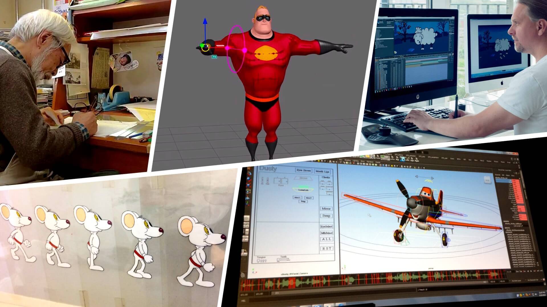
Illustrator is a popular vector graphics editor used by designers, artists, and illustrators to create a wide range of digital artworks. Unlike raster graphics (which are made up of pixels), vector graphics in Illustrator are based on mathematical equations, allowing them to be scaled infinitely without losing quality. This makes Illustrator particularly well-suited for creating logos, icons, illustrations, typography, and other designs that need to maintain clarity at any size.
We will spend the first 20 minutes of Thursday’s learning Illustrator
10:30 Micro Story Final Draft
10:50 Morning Break (10 minutes)

11:00 Abridged English

You go to lunch at 11:40 today, as you have to be back in CAWD for attendance at 12:10.
11:40 Lunch

- No food in the room / eat in the Cafe.
- You are welcome to return to the room when you have finished eating and work / hang out.
12:10 Attendance
WCAX Field Trip

- Listen to all the adults
- Mr. Dowmann
- Mr. Bohmann
- me
- Claudine
- The team at WCAX
- This guy
- Ask Good questions
- Behind the camera jobs
- Video editing jobs
- Audio jobs
- On screen graphics jobs
- Don’t touch anything
- Just … be cool.
2:20 “19 Minutes”
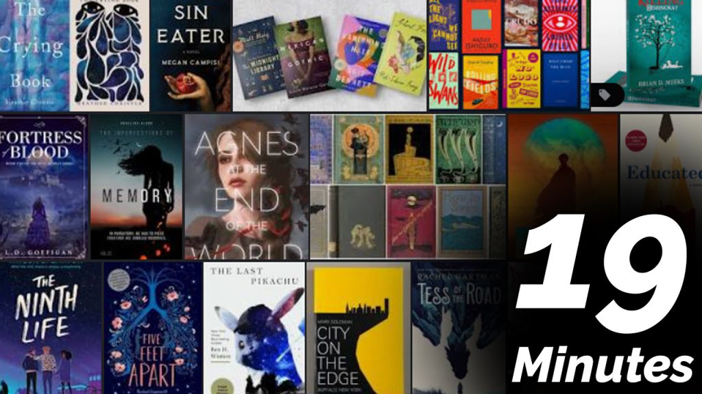
4 of 5 days per week we will end our day in CAWD with the “19 Minutes” of silent reading. Closing down our day with silent reading provides many benefits:
- Improve Literacy Skills / Reading Stamina
- Create space for a small reading meditation where we can disconnect from the world and get lost in a story
- Unplug
At 2:39 each day I will come to 3 students and ask for a 1 sentence explanation of what happened in your story over that day’s reading session. It is neat to hear little pockets of a story, here and there.
2:40 Dismissal