Class hours: 10:05 – 2:45
Mr. Bohmann | wbohmann@ewsd.org
10:05 Today’s Notes & Attendance

Today is a Wacky Wednesday
Call Backs: Tobi: 11:10am, Student Services, Aidan:1pm, Mrs. Maley Classroom
Field Trip tomorrow – make sure you have communicated with your afternoon instructors that you will not be in class.
Star Wars Fan Film reflections are past due. Please complete this today. Complete sentences with grammar and spell check.
10:10 Web Stuffs – CodePen

I love CodePen. Codepen is an online code editor and a social site for front end web developers to share their ideas and code with each other. Each month there are very challenging “Code Challenges”. I enjoy seeing what others make and how they organize and write their code. Very creative and great for generating ideas for your own projects.
We’ll use CodePen a lot as a quick place to try out some code ideas. The benefit is it is quick. Codepen does not require creating an HTML doctype, head tag, linking stylesheet or js. It all links. So we can quickly get to code/coding. I use this space a lot to play with ideas and test modules.
Task: Login or Create a Codepen account. Then, go to challenges and take a look around. Also, check out Spark – which is a weekly of posts and links all things web dev. Code included. Find something interesting. Go down the rabbit hole.
Then: Take on the Challenge: Recreate the handout I provide you.
ProTip: Code on Paper first to organize your document. Then, Fork this Raw text and recreate to look like the handout. Use semantic elements. Try to study what is happening so you know what structure to code.
Completed CodePen Dropbox for Cinnamon Raisin Rye Bagel can be found in Google Classroom
10:50 Break

11:00 LTA – Photography Shares
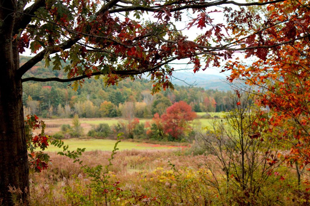
At the end of your slideshow or when presenting – you may talk about your images and say a few words.
- For Sure: Point out your favorite image / explain why it is your favorite image
- Not A Bad Idea: To share any techniques that you used – we love technical terms!
- Indubitably: Let us know if you have improved as a photographer and why
I will ask you two questions from this group of questions:
- What was a challenge you faced during this project?
- What photography assignment did you enjoy the most?
- How has your study of photography changed how you approach taking photos?
- What type of photography do you enjoy the most?
- Do you plan to continue exploring photography?
- Have you shared any of your learning with others?
The Order:
- Tobi
- Peyton
- Aidan
- Phoenix
- Scotty
- Isaac
- Mia
- Ben
- Elizabeth
- Braden
- Gabi
- Zander
11:55 Lunch

12:25 Independent Reading
12:50 Break

1:00 Production Time and Guided Support
Current Assignments:
- Version Two of resume
- HTML Resume
- Hamburger – Recreate the handout
1:50 Dailies

Dailies can be placed in the CAWD2 Dailies Folder on the CAWD2 Public Folders drive