Class Hours: 10:05 – 2:40
Mr. Bohmann | wbohmann@ewsd.org
10:05 Today’s Notes & Attendance
- One day left in Quarter 2 – Friday, 2:45pm deadline
- English Today
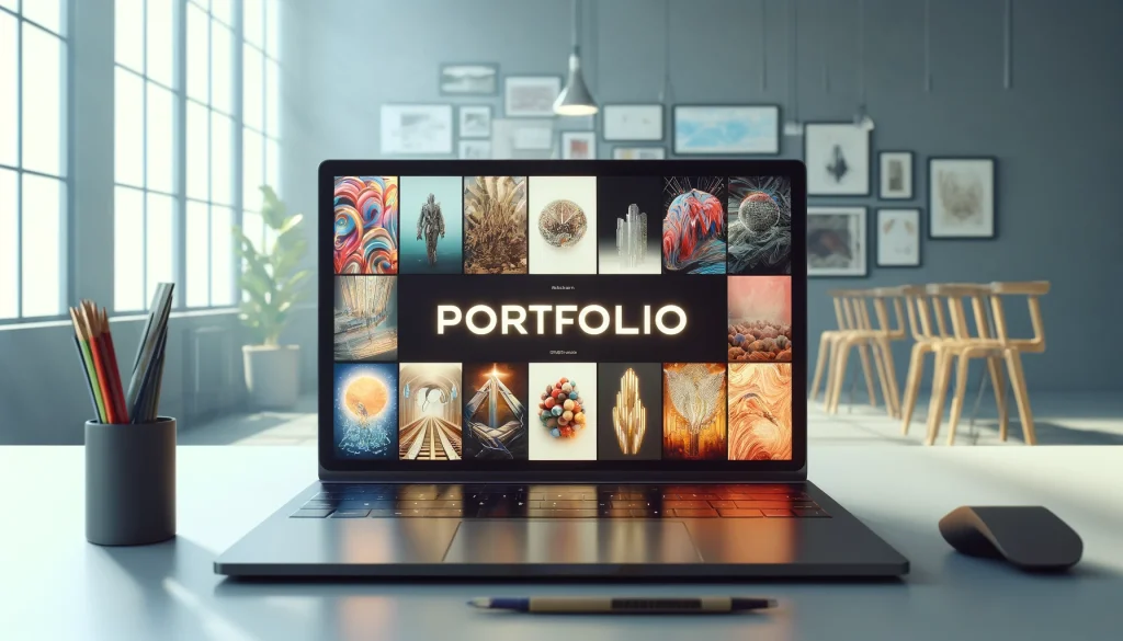
- Portfolio work sessions – today and tomorrow – that’s all. The rest will have to be during independent afternoon work time next week. Deliverable is January 23rd.
10:10 CSS Grid Continued…
Popular Layout Options: 960 Grid which is a concept of making websites 960px wide and then dividing up the 960 pixels into 12 columns (60px each). But we can do the same thing with CSS Grid. Link to a great website on all things CSS Grid – it is everything you need to learn CSS Grid Layout.
Yesterday we looked at how easy it is to set up grid. Just like flexbox we need a container.
Using nth of type or custom classes is a great way to move items around your grid
grid-template-columns: (for setting number of columns) (we can use px, % or fr)
grid-column or grid-row: To assign our content to those columns or rows. (we declare where to put them by using an address of vertical or horizontal lines. ex. grid-column: 1 / 4)
The rows that are created are a result of the columns or we can declare our rows:
grid-template-rows (for setting rows) [explicit grid]
Use gap to create space between your grid (it will not add space on the outside of the grid area!)
There are two common layouts with grid.
- The first layout is called a Pancake layout. It is an excellent choice for mobile and for desktop. Using height on the container will push the footer nicely to the bottom of the page.
- The second layout is a typical web layout with the header taking up the top, the main taking up two thirds with a sidebar and a footer that extends across the bottom. Adding extra space for a nav.
- Remember, you can use flex and grid inside any of these layouts!
Pancake Layout / Traditional Layout Demo – using CodePen
To create a pancake layout, we can make three rows by using grid-template-rows: auto 1fr auto. The second row with a value of 1fr will expand as much as it can, whereas the other two only have enough space by wrapping their content. Let’s make a header, nav, main and footer. We’ll use some content on the web for this: https://eastcoastprinters.com/
.container {
  display: grid;
  height: 100vh;
  grid-template-rows: auto 1fr auto;
}
10:50 Morning Break (10 minutes)

11:00 Portofolio or WorkSession for incomplete work
11:55 Lunch
12:25 English with Mx. Yopp
1:10 Afternoon Break
1:25 Appreciating Experts in their field – FLOW
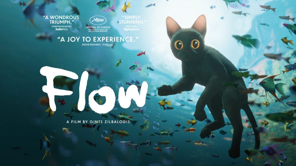
Flow is a showcase of stunning visuals, expert use of Blender, and achievement with major awards, including the Oscar for Best Animated Feature and a Golden Globe for Animated Film.
We’ll watch 45 minutes today and 45 minutes on Friday beginning at 1:25pm with reading to follow.
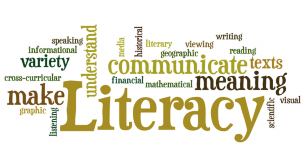
2:15 Focus on Literacy
2:40 Dismissal