Class Hours: 10:05 – 2:40
Mr. Bohmann | wbohmann@ewsd.org
10:05 Today’s Notes & Attendance
- Week 16
- Let’s check that mail – just a minute to do that
- Visitors coming on Thursday from MMU and WHS
10:10 Exploring More Front End Frameworks
There are other Frontend Frameworks on the web…. many others……
W3.CSS is part of the W3 Schools documentation and has no JS, just pure light CSS classes
Foundation is a popular modern and reliable web development framework
Pure.CSS is another easy to use framework with good documentation
Metro 4 is a quick to use scaled down framework
Semantic UI is pretty similar to Bootstrap – nice components
Bulma free open source CSS framework
and there are many more..
Questions – I’ll set a timer for 5 minutes. Jot some notes while you do a quick investigation. Prepare a response to the following questions:
- Is this framework free?
- Is the framework open source?
- How was the documentation? (like.. does it make sense) What companies are using this framework?
- Were there example or tutorials available?
- Scale of 1-10 (10 being heavy lifting) how hard do you think it is to use? What made this Framework different from your Bootstrap experience?
10:15am Bootstrap
If there is one take-away about Bootstrap is that the classes you use in conjunction with your html elements create a lot of the layout and style! Here is an excellent Cheat Sheet
The second takeaway and most important part of understanding Bootstrap is that Bootstrap is built on the Grid system and is a mobile first approach.
Bootstrap pages always have the following pattern:
- A <div class=”container”> to wrap everything
- A <div class=”row”> to start a new row
- A <div class=”col-md-8> or some other arrangement of columns within the row . col – * – * Let me explain:
col stands for column
sm stands for the size screen your column will break, sm is a good default (as it will be a single column or pancake layout for mobile screen sizes)
8 stands for the number of grid spaces you want the column to take (there are 12 grid spaces in Bootstrap)
<div class="container">
 <div class="row">
     <div class="col-sm-4">
      One of three columns
     </div>

     <div class="col-sm-4">
       Two of three columns
     </div>

     <div class="col-sm-4">
        Three of three columns
     </div>

 </div>
</div>
10:25 Bootstrap Rows
Yesterday we made some rows. Let’s dive a little deeper….
Rows are designed to be column containers. If we don’t state a size, the row will distribute the columns along the grid inside the row. Let’s look at an example in CodePen. (be sure to fork it). What happens when we have more than three columns in a row? What if we don’t specify an amount to space on the grid?
Row Columns (row-cols-__) classes create an equi-distant grid of content. This is really handy if you want to create a grid of images or content. The only drawback is that they do not scale as nicely depending on how many row-cols you create. Your limit with row-col is 5. (1-5)
Let’s make some robots while we do this too. You’ll see what I mean.

10:50 Morning Break (10 minutes)

11:00 Food Truck needs a Website! – Ruth Kosher Food Truck in Burlington

Here is a recent article in Seven Days
This page will give you information about the Menu and information about the hours and some basic information about the owner
Project Deliverables:
- One Page website build using Bootstrap
- A Wireframe of your design completed and turned in on paper (Wireframe will be for both Desktop and Mobile)
- Mobile friendly below 576px (sm breakpoint)
- Bootstrap Navbar with links to each section
- Links are set as id (so it scrolls to the different sections – (example))
- 2 sections – minimum (which includes the menu)
- You may use internet images to assist you
- 1 footer with copyright information and your name
- Incorporate Bootstrap Icons somewhere on your site as you see fit (but don’t overdue it)
- Head tag with meta data, keywords, title, author
- Clean Validation of HTML and CSS (if you use additional CSS) however I don’t want you to use much additional CSS or any at all, unless you have to… (in fact, most of your styling should be from Bootstrap!!!!)
I encourage you to consult the Bootstrap Docs page to learn about different components you might want to use like the accordion, carousel, buttons and modals. Bootstrap has a lot of great components ready for you.
I encourage you to look at Bootstraps Examples – there are many great resources all available to assist you.
This project is due on Monday, January 12th at 10am on your server. Plan accordingly. Client presentations will be delivered at 10:05 and you don’t want to be unprepared!
11:55 Lunch
12:25 The Visual Resume
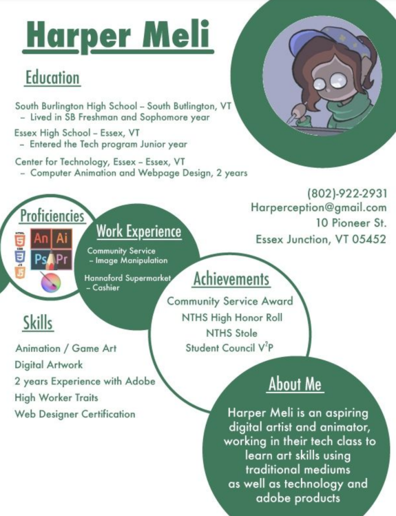
A visual resume is a nice addition to your traditional resume. To the left is a nice example that showcase some different ways to making a resume page for your website/portfolio
The advantage of a visual resume is it draws the eye to your webpage and does not have to include everything on your resume, just the items you think are most exciting or interesting. Going outside the traditional resume gives your viewer something exciting to look at.
Harper’s example was made in Illustrator (you can use Photoshop too) and then saved as a .jpg. Harper created a page on their website that was this visual resume. Harper then created a call to action button on the page to get the user to download the traditional paper resume. (Harper was a GAWD2 student)
Here’s another example from a former student – made in Illustrator.
Other things you could consider doing on your Resume Page:
- Add CSS to your HTML resume (if you coded a HTML resume) to get some custom looks – Student Example
- Add the display element to create a drop down effect
- Add an accordion
Your Task / Deliverable –
- Create a Visual Resume from your traditional resume.
- Add your Visual Resume to a new page on your website called Resume
- Include a downloadable copy of your traditional resume. That resume will be a PDF (I’ll show you how to do this and will help you fix up your traditional resume)
This project will be due on Monday, January 19th.
I’ll spin by your desk and discuss your resume with you today and you begin some planning.
1:10 Afternoon Break
1:25 Speed Design

1:45 Independent Production & Guided Support
- About Me write up and photo – Due Thursday 1st Draft
- Ruth Food Truck website using Bootstrap – Due Monday, January 12th
- Visual Resume – Due Monday, January 19th
2:10 Dailies
2:15 Independent Reading
2:40 Dismissal