Class hours: 10:05 – 2:45
Mr. Bohmann | wbohmann@ewsd.org
10:05 Today’s Notes & Attendance
- Read Dayplan – start on Portfolio work when the room opens. See Mr. Cronin if you have question.
- I will arrive by break at the latest!
- Early Lunch today
- SLC Meeting today during lunch in m117
- Q2 Ends on Friday – all work due by 2:45pm
- CTE Language of January is Vietnamese!
- I will be arriving by 11am – begin by working in your portfolio work. There will be very few worksessions for this.
10:10 Portfolio Worksession

10:50 Break

11:00 A CSS Surprise…
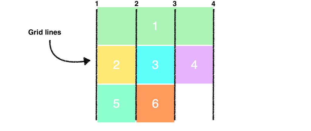
CSS Grids
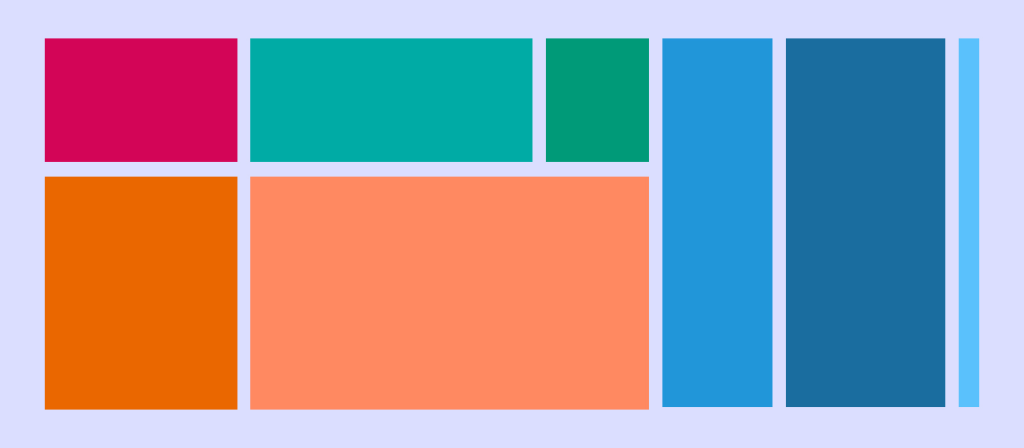
CSS grid layout or CSS grid is a technique in CSS that allows web devs to create complex responsive web design layouts more easily and consistently across browsers. The layout above is very easy to accomplish with Grid!
Flexbox is a one dimensional type of layout. CSS Grid allow you to layout in TWO dimensions.
CSS Grid Property Terminology to Know
- display: grid (you’ll need a container)
- grid-template-columns: (for setting number of columns)
- grid-template-rows (for setting rows) [explicit grid]
- grid-gap (for setting the gap between the grid areas)
- nth-child ()
- fr (stands for fraction, can be used instead of percentage)
- minmax (for setting height min and max or width min and max)
There are some good inspection tools for grid. Let’s look at those too.
Let’s jump into our SandBox in Code Pen – here is a starter project – just remember to fork it –
We’ll create two basics layouts – a simple grid of spaces and a classic layout called the Pancake Stack (I love pancakes). The pancake stack (one of the most popular designs out there) is soooo easy with grid.
If you get confused, just remember that grid is all about counting the lines between the columns and rows
Hey, this is a really helpful interactive resource for CSS Grid. ProTip – Add to your Web ToolBox!
11:35 Lunch
12:05 Web Sprint Team Project
From the word go – you will be on the clock. Showcase at 1:20. I’ll give you the prompt and the teams.
| Time | Manager (Project Lead) | Designer (UX/UI) | Coder(FrontEnd) |
|---|---|---|---|
| 0-10 min | Set goals and define the “Definition of Done” | Sketch mobile-first layout (578px) Sketch desktop layout | Set up dev environment in VS code |
| 10-40min | Write all Copy | Handle color palette Handle images and icons for coder | Build structure and take design cues from designer |
| 40-50 min | Error Checking/Validation | review design and check responsiveness and visual polish | Populate content and add interactivity – call to action button |
| 50-60 min | Finalize Deployment, test | Deploy live |

Tips for Success
- Focus on One Goal: The page should have only one clear Call to Action (CTA), like an email sign-up or a “Buy Now” button
- Use Placeholders: If the designer is slow, the coder should use robohash images to keep moving.
- Keep it Simple: Avoid complex backends; focus on the visual “hero” section and a few trust signals like fake testimonials.
Product: Labubu
Deliverable: Create a product landing page, include image or images, testimonials (3) and a call to action button like an email or “buy now” button. Include a footer.
Place entire project when ready to deploy in today’s Design Challenge Folder – called Labubu
Validate your html and css and set up your images so they are not resource heavy(rezise to manageable sizes to take up less space
1:10 Showcase

1:20 Independent Reading